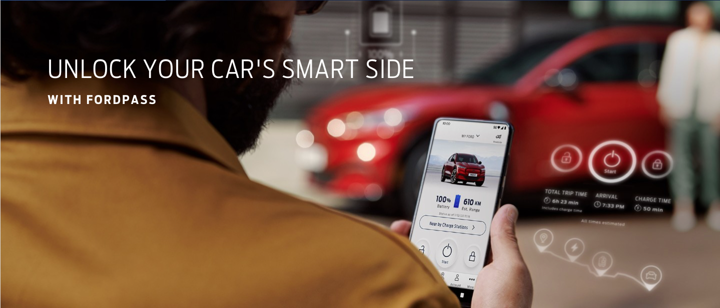
FordPass HMI Challenge.
Streamlining Trip Filtering for In-Car Infotainment.
01 | The Sprint: High-Stakes HMI Design
The Challenge: In a rapid 8-hour sprint, I was tasked with designing a trip-filtering feature for the FordPass In-Car Infotainment System. The goal was to solve a specific productivity gap: allowing professional users to categorise and export journey data for quarterly expense reporting.
The Persona: Peter, a tech-savvy professional balancing business and personal mileage.
The Environment: A high-constraint HMI (Human-Machine Interface) where safety and legibility are the primary guardrails.
Staff-Level Strategic Framing:
Role: Lead Product Designer (Rapid Sprint).
Core Conflict: Balancing deep data retrieval with the strict safety protocols of an in-vehicle environment.

02 | Rapid Discovery: The "Helicopter View"
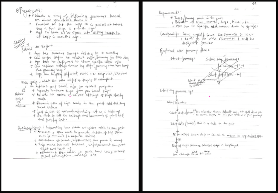
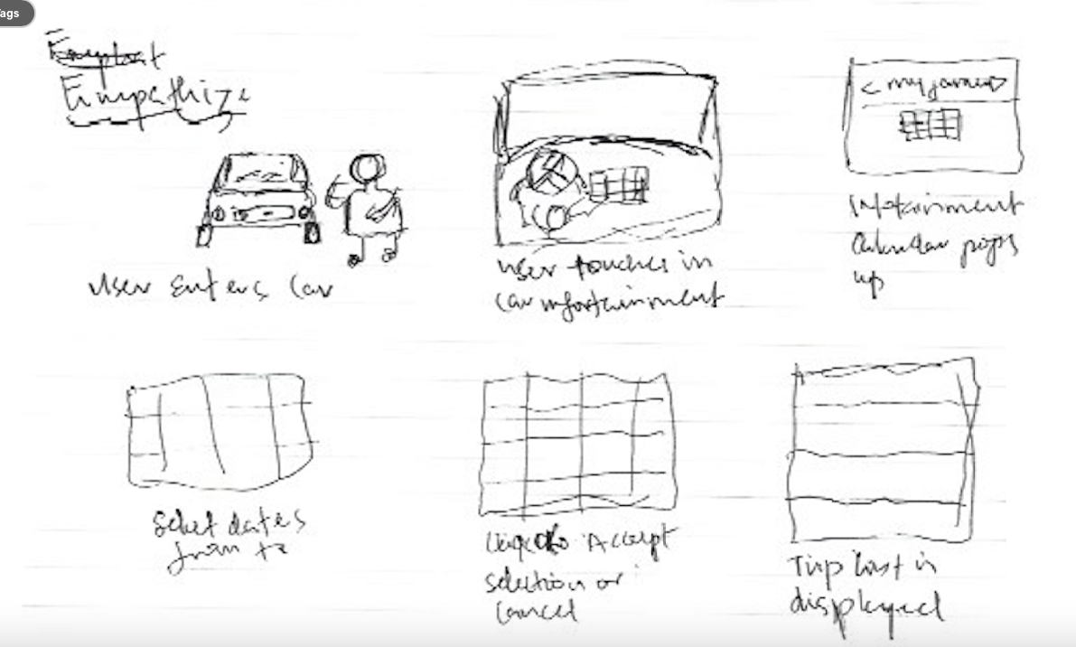
To meet the tight deadline, I utilized a "Helicopter View" approach—moving quickly from messy ideation to structured requirements without losing sight of the cohesive vision.
Analogue Ideation: I began with physical sketching to map user goals (e.g., 6-month data retrieval) against hardware constraints (e.g., ignition status) before moving to Figma.
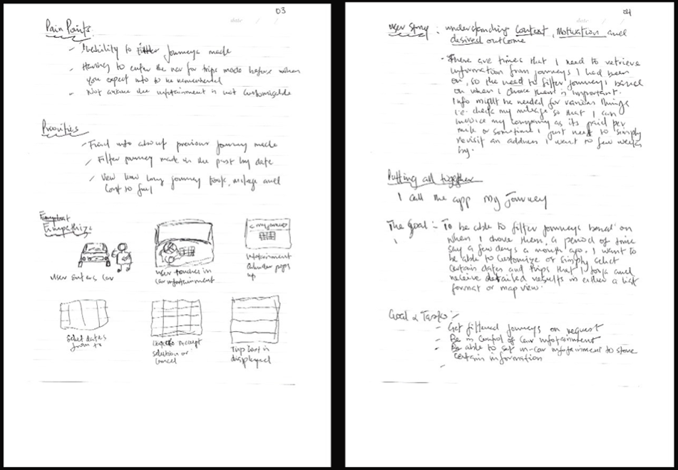
Empathy Mapping: I identified that Peter’s primary friction wasn't just "finding data," but the cognitive load of manual note-taking while in a vehicle.
03 | Strategic Constraints: Safety as a Feature
At the Staff level, deciding what not to build is as critical as the design itself. I established two non-negotiable guardrails:
Safety-First (Hard Constraint): Journey filtering is strictly disabled while the vehicle is in motion. By prioritising driver safety over feature access, I ensured the system adheres to global automotive safety standards.
Zero-Barrier Entry: To provide a "Seamless A-to-B" experience, I removed login friction. The system identifies the driver via the ignition/key-fob, allowing for immediate utilisation.
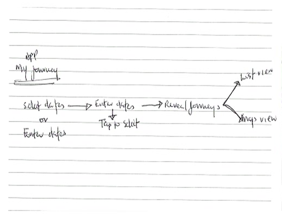
04 | Architecture: The Linear Diary
I transformed a complex branching system into a Linear Diary experience, reducing "menu-diving" and keeping the user focused on the task at hand.
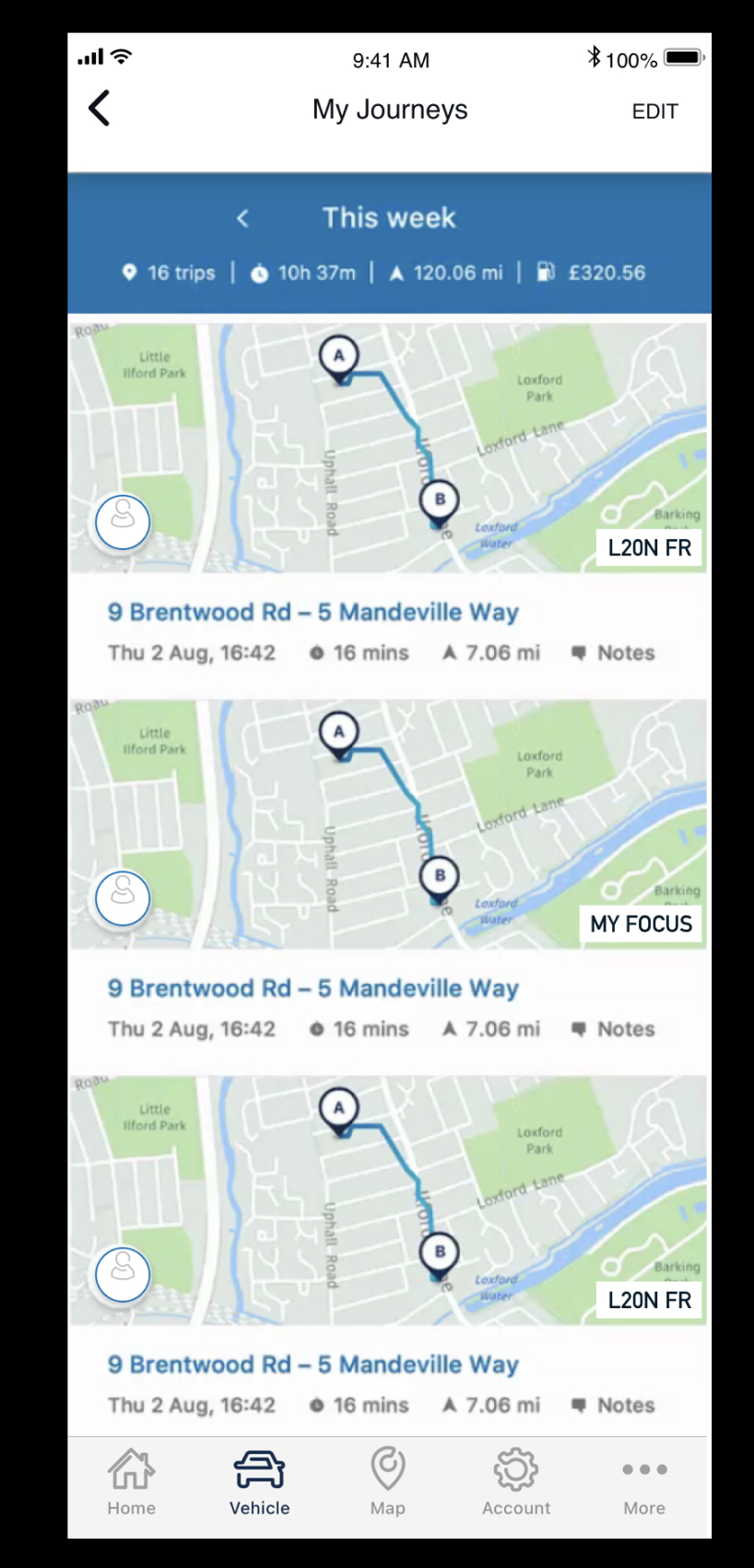
The Flow: Entry (Calendar) → Filter (Date Range) → Review (Consolidated Metrics) → Action (Map/List Verification).
Staff Insight: I focused on Information Architecture (IA) that prioritises "glanceability", ensuring Peter can verify a client location in seconds.

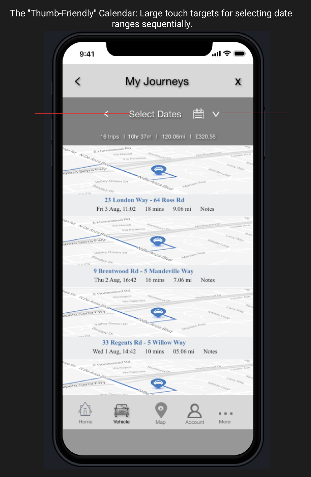
05 | Low-Fidelity Execution: Designing for the "Thumb"
Designing for HMI requires sweating the details of physical interaction. My wireframes focused on High-Contrast Legibility and "Thumb-Friendly" touch targets.
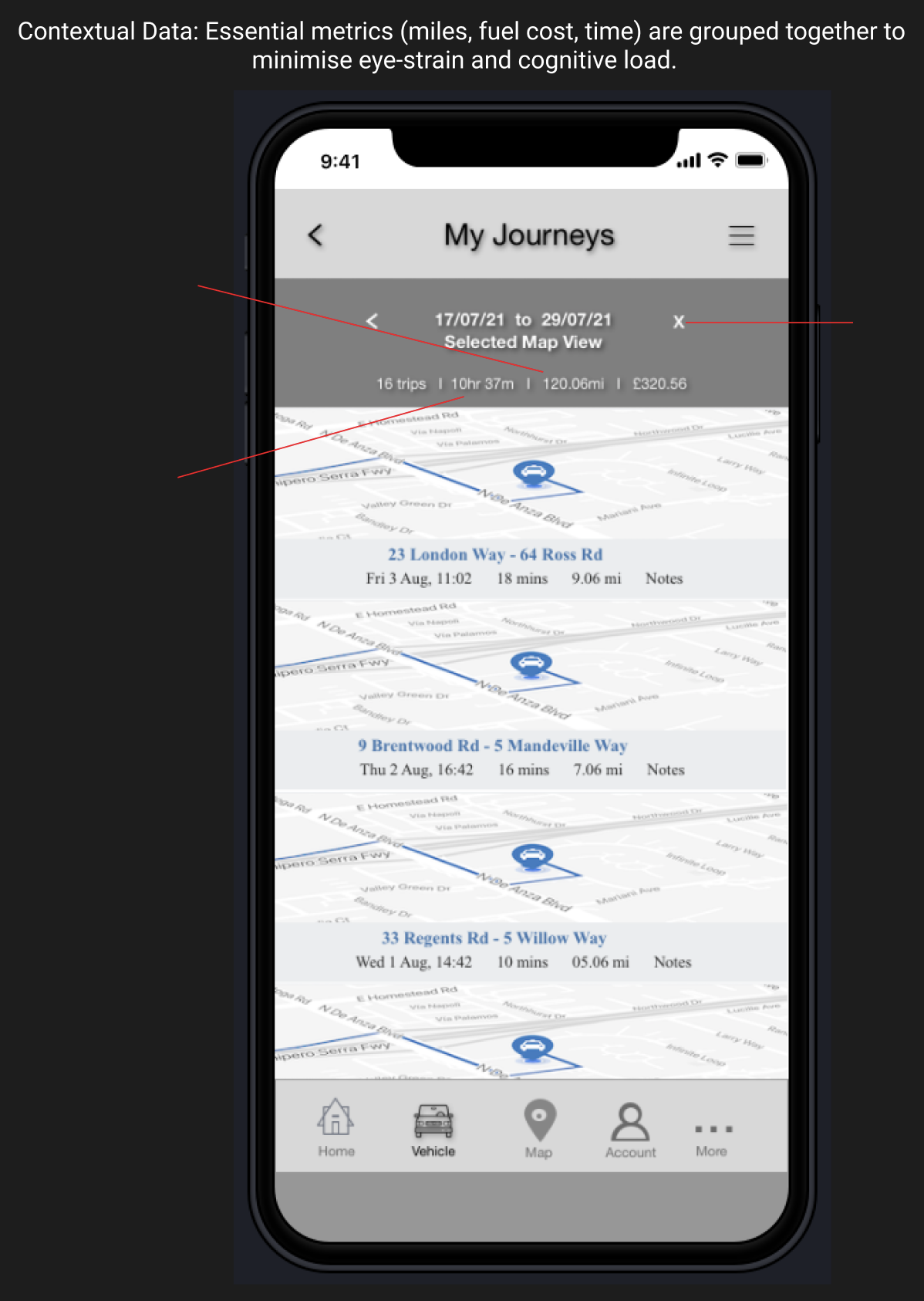
Contextual Grouping: Metrics (miles, fuel, time) are grouped to minimise eye strain and cognitive load -essential for in-car productivity.
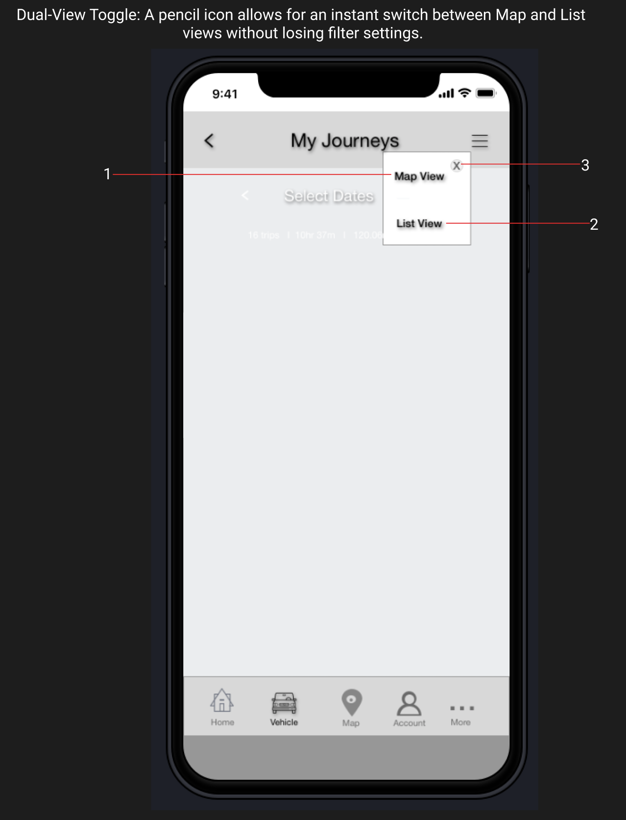
Persistent State: A "Dual-View Toggle" allows users to switch between Map and List views without losing their filter settings, maintaining System Status visibility.
06 | Staff Reflections: High-Velocity Design
This challenge served as a stress test for my ability to set direction under extreme time constraints.
HMI Expertise: I demonstrated a deep understanding of vehicle hardware constraints, specifically the logic of Stationary vs. Motion states.
Productivity over "Feature Creep": By focusing strictly on expense reporting, I delivered an MVP that is business-ready and technically feasible.
Systems Thinking: I translated "Picasso-style" scribbles into a professional and auditable user flow that could be handed off to engineering immediately.