A design exploration to improve the remittance app’s user experience when sending money to sub-Saharan African nations.
Remittances refer to funds sent by immigrants working abroad to their families in their home countries. In 2021, according to the World Bank remittances to sub-Saharan Africa surged by 14.1% to reach $49.1 billion, providing substantial benefits to numerous families and regional economies. Nevertheless, sending remittances remains cumbersome for immigrants, compelling them to ignore formal channels for informal channels. Additionally, the expense of sending $200 across borders remains high at 6.4%.
Informal remittance channels, though unregulated, is popular amongst Africans in the diaspora, accounting for a significant portion of transactions (35-75%). However, concerns about illegal activities persist. A deeper understanding of country-specific traits could shed light on payment preferences, ultimately enhancing the experience, safety, and efficiency of the international remittance market.Objective.
The discoveries and observations gleaned from my research endeavors will serve as the cornerstone for crafting a formal remittance application tailored to alleviate the challenges faced by sub-Saharan African users when sending money. By integrating Jacob Nielsen's design principles, the app will be meticulously shaped to cater to the distinct needs and preferences of this user demographic. Through this alignment of user-centered design principles with business goals, my objective is to not only enrich the user experience but also to optimize the remittance process, providing users with a seamless and worry-free means of sending money to their families and loved ones.Company: Moyo Exchange, a remittance app.
My Role: Product Designer.
Tools: Figma, Miro, Zoom, Otter.ai, Marvel, Google Forms, sketching, Post-it notes.
Strategic planning is essential for achieving success.
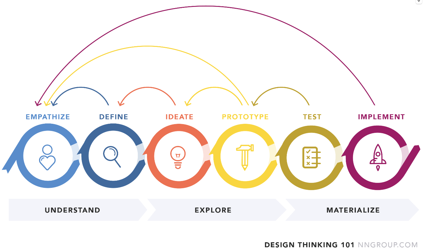
To effectively manage the constraints posed by this project's tight schedule, I devised a comprehensive approach that integrates the principles of both double diamond and agile sprint methodologies. I also added design thinking as a complementary approach to effectively manage the project's timelines. This strategic framework ensures that my workflow remains streamlined, goal-focused, and characterised by meticulous attention to detail-oriented with a strong emphasis on precision.

Embracing the double diamond methodology made me realise the project's progression, a dynamic and cyclical process, enabling me to consistently revisit and refine each stage and promote continuous iterative enhancements.
Design Thinking is a human-centric methodology that strongly emphasises understanding users' needs and challenges, guiding a structured process involving empathy, problem definition, creative idea generation, prototyping, testing and implementation. Its strength lies in the ability to identify problems and inspire innovative and user-centred solutions while fostering a deep sense of empathy for the end users.
Research to develop knowledge… empathize with users and their perspectives!
I conducted comprehensive research on how users experience remittances, combining it with benchmarking analysis within the fintech industry. It is essential for gaining a deeper understanding of the environment in which the product would operate. More importantly, it would help reveal crucial insights and emerging design trends.

Traditional giants like Western Union maintain a substantial presence in the remittance sector but often overlook the unique needs of their African user base. In contrast, emerging fintech companies are disrupting the industry with designs prioritising users and cost-effective solutions.
Comparison platforms are helping customers find affordable options, but tailored regional services like M-Pesa and Lemonade Finance, which offer better exchange rates, are notably absent from these comparison platforms. While mobile money services like M-Pesa have revolutionised financial inclusion, they encounter challenges related to erroneous transactions and network reliability. On the other hand, LemFi, a fintech company based in the UK, offers competitive rates, but based on user feedback, they grapple with significant lousy user experiences. It's clear that for fintech companies, prioritizing a user-centric design approach is crucial to elevate the overall user experience. Aligning UX design with business goals necessitates a deep comprehension of user behaviors, needs, and pain points. This alignment will enable the creation of solutions that not only fulfill user needs but also play a pivotal role in accomplishing the organization's broader objectives.“Migrants’ preference for payments channels are influenced by personal traits, country conditions, costs, convienience and choices. Promote financial education, reduce costs and introduce innovative mobile solutions to influence payment decisions”
“Remmitance and fintech companies should focus on customer centric and user friendly product designs. By using design thinking and incorporating user feedback, you would be creating solutions that addresses user concerns and offer better overall experience.”
The long-term success of technology platforms depends on sustained usage beyond the initial adoption phase. Complex sign-up processes and ineffective technology use can hinder development. Identifying what motivates people to sign up and keep using the technology is essential.
-Bhattacharjee (2021)
Migrants choose remittance channels based on their home country’s currency situation, familiarity with the service and regulatory environment. Ease of use, proximity, reliability, and cultural alignment are essential factors.
“Trust and familiarity often matter more than service cost.”
Competitive research:
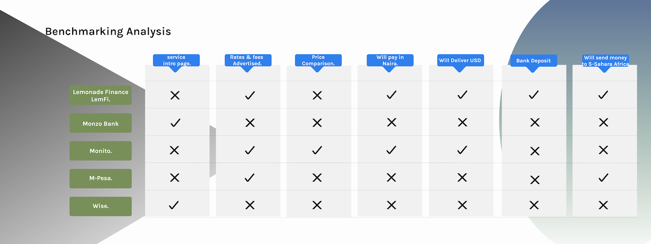
In a quest to gain insights into effective fintech app designs, services, and user onboarding experiences, I conducted benchmarking studies of various fintech apps, including Monzo Bank, Starling Bank, M-Pesa, Lemonade Finance (LemFi), and Wise. The focus was on evaluating their designs and onboarding processes. Notably, customer journey and feedback are crucial in fintech app designs, as emphasized by (surf) a mobile app development company. Market leaders like Monzo and Starling have revolutionized online banking by eliminating traditional high-street branches.
Additionally, I explored best practices, found out that "offering a unique experience and a value proposition that meets user needs is essential" according to market research recommendations. A key observation across these apps is the introduction of products and services upon landing on the home pages, allowing users to control their interaction and quickly sign up or sign in.
Market research:
In preparation for developing a remittance app targeting the Diasporas sending money to sub-Saharan Africa, I conducted market research. This involved gaining insights into the remittance market, understanding the target audience's demographics and spending habits, and exploring various remittance types. This research lays the foundation for creating user-centric features and services that cater to the specific needs of this user group.Users/Accounts
Mobile money is booming in Africa due to tech access and the pandemic. It provides financial inclusion for the unbanked. In 2019, Sub-Saharan Africa and the Middle East/Northern Africa accounted for 64% of global mobile money transactions, with $456.3 billion in Sub-Saharan Africa. Key players like M-Pesa and MoMo are thriving. However, regions with better banking access see less mobile money use. Despite this, mobile money's future in Africa remains promising to address financial inclusion. (Statista)Overall:
Sub-Saharan Africa's P2P remittance payment market is thriving, hitting $49.1 billion in 2021, a 14.9% increase despite the pandemic. Statista reveals that 77% of Africans in the Diaspora use P2P remittance payments. Key players include WorldRemit, Wise, and Skrill, with Wise leading at 15% market share. However, Wise halted services in Nigeria in 2022, and Skrill only sends USD a currency that is not locally accepted. World Remit, the third-largest, primarily offers airtime top-ups. This market also overlaps with personal finance management services.The industry is evolving, and innovation is vital to stand out.Western Union still dominates the remittance market despite fintech startups.Comparison platforms like FXcompared and Monito would help users find the best rates.Tailored platforms like M-Pesa and Lemonade Finance focus on specific regions but are often missing from comparisons platforms where they can be found globally.New entrants in the remittance market emphasize user-centred design and cost-efficiency, with modern technology for unique experiences.
Competitive Research
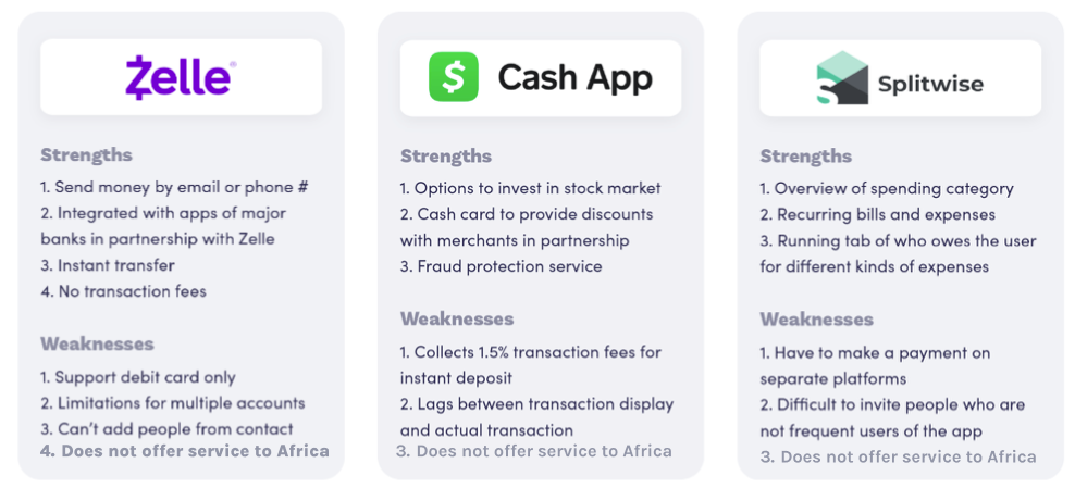
It is equally important to research other remittance payment apps, as their strengths and weaknesses will not only shed light on the key areas we should strive to maintain high quality but also help identify any opportunities for Moyo Exchange to emphasize. Based on the knowledge I gathered from market research, I analyzed three direct competitors, major remittance payment service providers and two indirect competitors who integrate P2P payment features into their service. A complete competitive analysis can be viewed Here.
Provisional Persona.
With the data gathered from market research, I started to generate provisional personas using the statistical and behavioural knowledge I gained to represent a specific type of user that is a potential audience of the Remittance App. These personas will help me screen appropriate people to interview.

User Interview
Building on a general understanding of the market and the audience, it is time to dive deeper, make real connections with our users and gain direct insights from them through primary research. I created an Interview Guide to facilitate the user interview process, with 11 open-ended questions to invite the participants to share their experiences using remittance apps and stories about their sending money habits. I set up a screening question to identify frequent users of remittance apps or platforms who send money at least a few times a month. I invited 5 participants (3 females and two males) to participate in the interview.Assumptions Validated
Remittance users are people who care about their families. Validated. 4/5 users use some methods to manage their sending money habits, including tracking the sent money, keeping a record of money sent, etc.Remittance users sometimes use the app or platforms to check on exchange rates and fees. Validated. 5/5 users have used the remittance app to check for the cost of sending money, visited locations to ask questions about cost and exchange rates, when the funds will be received if not immediately, and methods of delivery, USD or local currency.Remittance users use the app mainly to send money to their friends or people they are familiar with. Validated. 5/5 participants used remittance with their friends, peers, or acquaintances.Remittance users tend not to send a large amount of money. N/A. Not enough participants shared the exact amount in this aspect.
Research Synthesis
Empathy Map
To synthesize the qualitative data gathered from user interviews, I created an empathy map to identify patterns across users, uncover insights, and generate needs.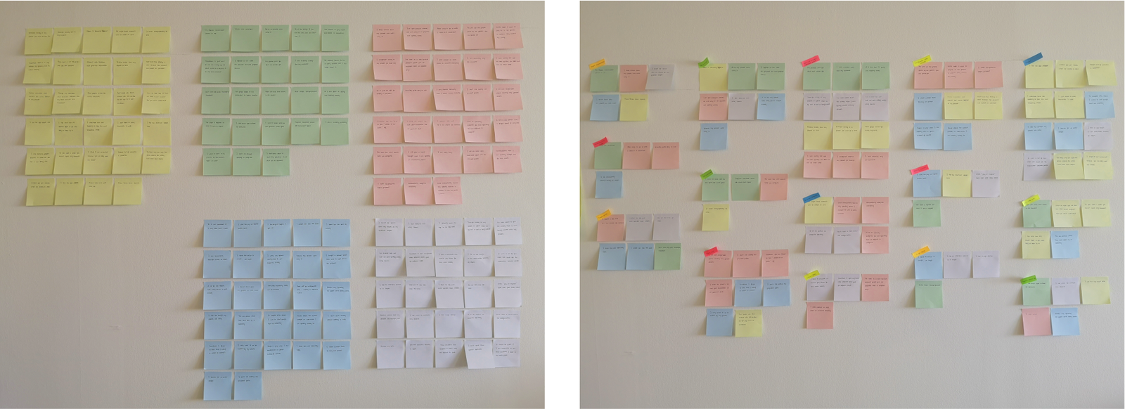
Insights
Users want to know about the costs also exchange rates before sending money.Users want the ability to compare prices so they can make informed decisions.Users want to be able to send money directly to their family members and friends without involving a third party.User wants to be able to send money privately and at their chosen time, not to be limited to office hours and locations.
Needs
Users would love to be able to track sent money within their accounts.User needs to reduce the time spent travelling to remittance locations to send money.Users would love to be able to retrieve the history of sent money up to 1-3 years.Users would love to be able to share receipts of money sent directly from the account.Users need to be able to add recipients from their telephone address book using the receivers telephone number or name.
Define: are there common pain point across different users?
Persona 1: Daughter - London Resident, Mimi.
Profession: Auxiliary Nurse
Device Preference: iPhone
Usage Pattern: Regularly sends money to family
Communication: Frequently utilizes WhatsApp messaging
User Persona Development
Through thorough research and interviews, I meticulously selected a mother-daughter pair to accurately represent our target audience in sub-Saharan Africa. I engaged in friendly conversations with these personas to delve deeper into their needs and preferences.
Introducing Mimi...
Mimi, a single mother and auxiliary nurse in London, faces challenges with the current remittance process to support her family in Nigeria. She seeks a user-friendly app for quick transfers, easy sign-up, and transparent fees, available 24/7 to fit her busy schedule.
Frustration:
Complex onboarding and remittance apps lead to unnecessary travel for money transfers.
Lack of transparency and excessive fees in app usage.
Inaccessibility of customer service options and progress tracking.
Apps overlook African market needs, complicating currency exchange processes.
Goals:
Send money securely via an easy-to-use app.
Enjoy a seamless onboarding and interaction experience.
Track transfer progress and receive timely notifications.
Demand transparency in fees and exchange rates.
Compare rates easily before proceeding with services.
Share transfer receipts conveniently with recipients.
Access local currency deposits or funds with ease.
Persona 2: Mother/Grandmother - Rural Nigeria Resident, Mary.
Location: Ado Ekiti, Nigeria
Profession: Kindergarten Teacher
Device Preference: Android phone
Usage Pattern: Actively engages in WhatsApp messaging
Needs: Relies on a dependable means to receive money from her daughter
Introducing Mary...
Mary, a grandmother and kindergarten teacher in Ado Ekiti, Nigeria, relies on funds from her daughter to care for her family. She seeks an African-centric app for seamless fund transfers in Naira, eliminating the need for burdensome city trips and providing timely alerts for incoming funds.
Frustration:
Travelling to receive money is frustrating when a reliable app could simplify the process.
Lack of consideration for the African market leads to apps that don't meet local needs.
Non-Africans developing apps for Africans without consulting the local community causes disconnect.
Filling out forms at branches for money collection could be streamlined with app usage.
Traveling to designated locations for funds often results in unavailable cash and lack of notifications.
Goals:
Receive funds arrival notifications directly in the app account.
Access customer support through the app for queries and concerns.
Minimize travel time to spend more quality time with family.
Enjoy an easy and enjoyable app sign-up process.
Interact with an intuitive app that caters to customer needs effectively.
Access local currency without the need to convert USD.
Receive funds outside of traditional working hours.
Have the ability to send money back to the UK when needed.
These personas, meticulously crafted from interviews and chat transcripts, provide a dependable reference for understanding our key audience's nuanced needs and behaviours.
Ideate: Strategies, how might we.
To establish the problems I aim to address, I formulated Point-of-View (POV) Statements to guide me in a purposeful ideation process. Additionally, I crafted How-Might-We (HMW) Questions, to provide a structured framework for brainstorming potential solutions. These statements and questions are informed by the insights and requirements I gathered from my Empathy Map analysis.Insights
Users want to know the costs and exchange rates before sending money.Users want the ability to compare prices so they can make informed decisions.Users want to be able to send money directly to their family members and friends.Users want to be able to send money at their chosen time, not to be limited to office hours and locations.
Needs
Users need to be prepared and aware of costs so they can save towards sending money.User needs to reduce the time spent travelling to remittance locations to send money.Users would love to be able to track sent money within their accounts.Users need to be able to send money at will and not within the confines of space but digitally, securely and intuitively.
POV
Users need to be prepared and aware of exchange rates and costs of transactions so that they can save towards it.User need to be aware they are saving money by knowing that they are being offered the best service while saving money.Users need to be able to track money sent to their family members within their account.Users need a digital remittance platform that’s safe, reliable and intuitive.
HMW
How might we help users be aware of these things before committing to sending money?How might we help users compare prices, see costs and fees before making transactions so that they can make informed decisions?How might we help users conveniently share transaction information safely?How might we help users send money to family members and friends at any time they wish?
1. How might we allow all users to compare prices freely without requesting them to sign up to join our platform.2. How might we be upfront and transparent with fees and costs involved in transactions before users commit; this will allow them to make informed decisions.3. How might we present complex financial data in a simple and actionable manner while promoting financial education.4. How might the sender share transaction receipts safely with the receiver within the application.5. How might we present the app benefits and sell features without getting in the way and ultimately get user-buy innGroup Brainstorm
In addition to my individual brainstorming efforts, I organize a group brainstorming session involving three participants. This collaborative activity enabled me to collect a wider array of solutions from diverse perspectives. Before the group brainstorming session, I distributed an agenda to each participant. During the session, participants had three minutes to brainstorm ideas for each question and two minutes to post their thoughts as sticky notes on Miro, an online collaborative platform. After two rounds of brainstorming, we allocated five minutes to discuss the brainstorming results of our collective ideation.product goals
Using How-Might-We questions and brainstormed solutions, I created project goals. These goals will guide future product development and help prioritize features for the app design.I defined business goals based on industry coverage and synthesized user goals from personas and empathy mapping. To ensure the product's usability and sustainability, I aligned common objectives by connecting specific business and user goals.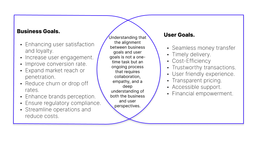
design workshops
In a collaborative effort, I engaged five stakeholders in design workshops to explore three crucial user journeys:First-time account sign-upDepositing funds into the accountSending money (the primary objective)
This approach allowed for a deep understanding of user experiences, aiming to create clear and engaging onboarding journeys for potential users.user journey map
By conducting these workshops and taking the personas on an enlightening journey through essential tasks, I gained valuable insights into what might cause pain points to potential users while embarking on any of the 3 different journeys (see user journey map). Additionally, I wanted to gain a clear understanding of the behind-the-scenes processes that would enable the app to offer exceptional services, so we decided on service design blueprint.Flowcharts displaying 3 different journeys:

Low fidelity prototype of the different journeys:
Ensuring app integrity and security via account registration involves robust ID verification. Users must upload government-issued ID, capture a live photo, and stay connected to their verified phone number. These steps enhances trusts and security, deterring unauthorized activities.-
![Sign on journey]()
Sign up
-
![Moyo]()
Add ID Document
-
![Moy]()
Add money
-
![moyo]()
Send money


A fuller picture emerges.
Monitoring our personas on the journey through these three tasks not only highlighted where potential pain points arose but also made clear what the processes were backstage that would allow Moyo Exchange to provide services. Proof of identity
Signing up for a Moyo Exchange account has many steps and requires the user to upload a photograph of their ID and snap a live picture of their face using the app connected to the verified phone number in real time. Different locations, different outcomes
For example, new account holders in the UK are issued an account number and sort code via Visa. New account holders in Africa will need to connect a Verve cash card; in Nigeria, you will need a (BVN) bank verification number issued by the government and already in the banking systems. Other countries will have a different process synonymous with their country/regions.No wallet ID, no transfer
Moyo Exchange remittance service users can only transfer to other Moyo Exchange user’s accounts via a wallet ID number you are assigned when you sign-up.To ensure the solutions are centered around our users’ needs, I devised the following Design Principles to guide all things Moyo exchange.
Accessibility
Sending remittance packages overseas can be confusing and overwhelming. Moyo Exchange will break this process down for people and design an application that is intuitive, accessible by all, user-friendly, simple and easy to use.Transparency
Current providers often hide the true cost of their service behind hidden charges and unscrupulous exchange fees. Providing transparency of costs and system requests will help Moyo Exchange build confidence and trust with users.Security
For many users, remittance packages are an essential lifeline for healthcare and basic living. Accordingly, it is essential that Moyo Exchange designs it's product and with security in mind, both in brand image and practice. Add money.
challenges
Challenges in account funding led to ideation using Crazy 8 sketch methods, aligning it with the flowchart concept. The most promising sketches were turned into a low-fidelity digital prototype, providing a clearer perspective for addressing these challenges.Sketched the concept of sharing account numbers to the Add funds journey.Flowchart highlighting the critical junction of the app.Prototype highlighting the point at which the account number is shared.
Send Money.
Sending money flowchart concept:
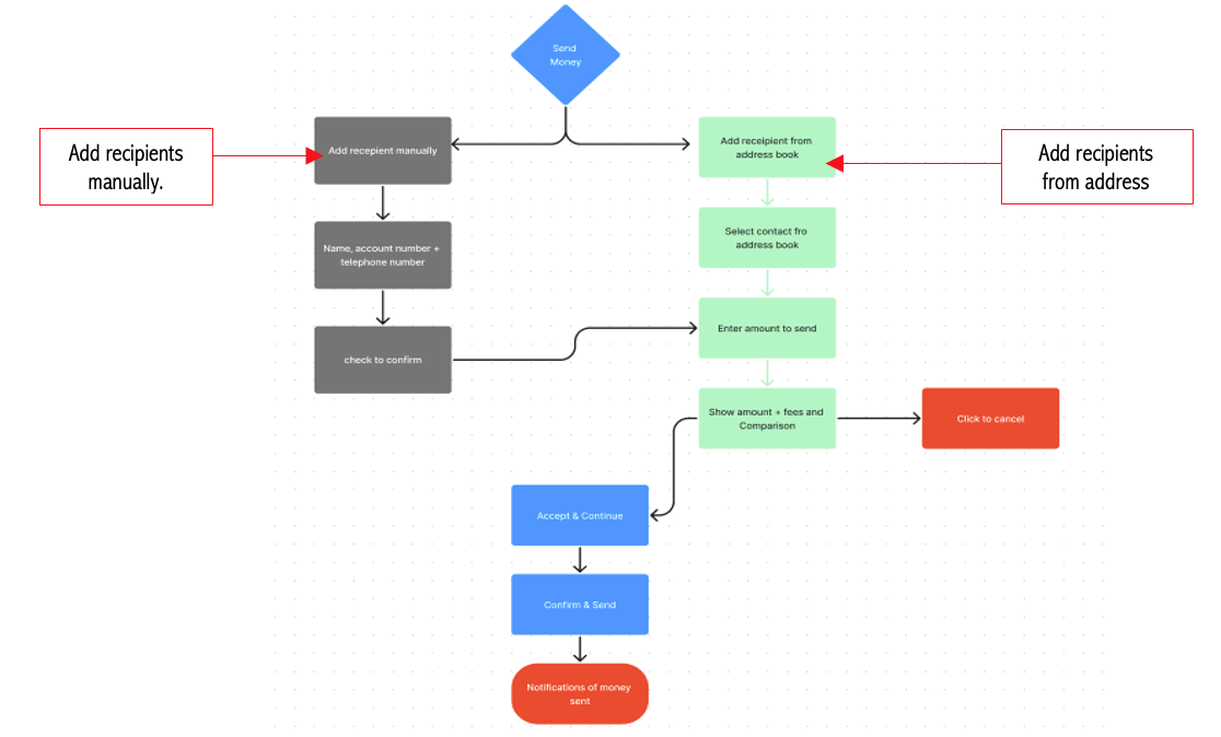
Recognizing the importance of having an account identification number for the money transfer process, a unique account number or name is assigned to new users. This account number functions as a digital address for sending and receiving funds within the app. To ensure effective sharing of this sensitive information, the design process involved referencing best practices, industry standards, and user feedback, resulting in three distinct ideas to be tested with users for feedback.Sketched the ideas on paper and then I created 3 prototype concepts below:
Feedback 1: This was found to be the least intuitive among users, with only 19% of them choosing it as their favourite. One of the reasons for this was that the ID number, located at the top left corner of the card, was not very noticeable on the screen. The "I" icon also failed to convey that the number could be shared without requiring additional investigation.

Feedback 2: This was regarded as the most direct solution by 29% of users. Click on the account ID button; then the wallet ID button appears on the next page which is visible on the screen; however, it doesn't indicate that it can be shared without navigating to the next screen.

Feedback 3: This emerged as the most popular choice during testing, as 52% of users voted it their favourite due to its high intuitiveness. Positioning the ID lower on the card was beneficial as it ensured the information remained prominent and easily accessible within the thumb zone. Furthermore, the iconography with “share” in the text associated with the concept was deemed more suitable for its intended function.
By closely observing these personas as they progressed through the three tasks, not only did I identify potential areas of difficulty for the users but also gained a comprehensive understanding of the underlying processes that would enable the app to cater to their needs. The insights gained from monitoring this journey and creating the 3 concepts were invaluable in refining the user experience and ensuring seamless interactions. Ideate again.
The problems participants encountered during the sign-up journey:
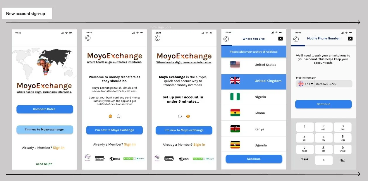
Users’ chose his/her country of residence to determine the default currency and allocate an account appropriate to the location! What if a new user’s country is not listed and they want to sign up? How will it be addressed in the design?

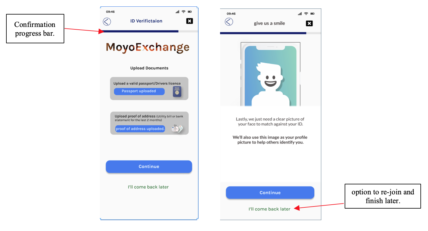
At this stage, users would have completed approximately 80% of the application process but still needs to submit a photo of their government issued ID document and face. Users felt the sign-up process would be completed at this point, how do I address that? using a confirmation of their progress bar with an option to rejoin and finish later would empower the user at this stage.
What if the OTP text message isn’t received during onboarding? How could the user prompt the system to resend?

Test fast, to fail fast!
Putting our low-fidelity paper prototypes to the test with users early on allowed us to get essential feedback on our user flow and identify friction points.
Selected early insights included:
1. How to sell the features to get user buy-in
The lack of information describing the app's purpose from the landing page meant that users were left unsure about its value and why they should commit to signing up.
A short product intro page and access to compare rates screen from the landing page would help promote users’ buy-in.
2. The length of sign up
Due to the necessary extra security to set up an account, users found the signing-up long-winded without indicating how long the signing-up journey takes.
The progress bar indicator at the app's top would keep users on-task, on track and focused throughout the signup process.
3. Explaining new ideas
A user’s Wallet ID is their unique identifier within the sendit.money system. It is essential to being able to send and receive funds. However, users were unsure of this significance or exactly how to use it within the product.
Testing ways to explain this using the contextual info button at stages would be essential to building a robust mental model.
Wireframes
I elected to use Figma as the interface design tool. I established a design system to maintain branding consistency and increase my workflow.
Scrutinising an individual feature such as this also highlighted other areas for improvement in our solution.
For example, by labelling the number “ID” on the card (as in concepts 1 & 3) and then proceeding to describe the function of the “Wallet ID” in the following overlay, we failed to remain consistent in our labelling. We reduced our capacity to build a mental model for our users.
After careful deliberation, we decided to describe this component as the “Moyo Exchange ID”. Thereby raising its status within the product and aligning it more closely with the brand.
Moving forward…
Usability Testing.
With the changes applied to wireframes and a prototype created, i utilised the Nielsen Norman Group principle that five users will be able to highlight 85% of usability problems. So i set about recruiting suitable participants from different demographics and recorded the results of course with their approval and consent.I asked each participant to complete the following four tasks:
Task 1 - Create an account with the appTask 2 - Add funds to the appTask 3 - Make a transfer to another userTask 4 - Share account detailsWhat I asked participants to do after completing the usability testing:
Once completed, kindly rate each of the journey from 1 = very difficult to 5 = very easy. Also, kindly rate the overall experience of the app using the scale of 1 = very difficult to use and 5 = very easy to use. I also advised them that their praise, criticism, advice, help, guide would be helpful in the iteration of the app to meet users’ needs and eliminate pain points. The Results.
The iterated prototype performed well with all five users, scoring 100% task completion across all tasks.The usability test recorded the time it took each participants to complete a task and the difficulty rating provided by the user at the end of each task.This quantitative data helped evaluate how efficient the user flow was and provided the product with useful benchmarking metrics to assess future improvements.Despite the encouraging quantitative data, the qualitative data from users' comments and behavior recorded during each test showed which areas required further development.
After Usability testing of the journeys.
The signing-up task emerged as a critical touchpoint for users. It became evident that users desire a straightforward and enjoyable app sign-up experience. They sought simplicity and convenience and wanted the process hassle-free and intuitive. This highlights the importance of streamlining the sign-up process by minimizing unnecessary steps and avoiding complex or confusing instructions. The app would create a positive first impression and encourage user engagement and buy-in by eliminating potential friction during sign-up.
A critical aspect that emerged during interviews and research was users' desire to compare prices before using the service. Understanding the importance of this feature, I prioritized its implementation within the app. Allowing users to compare prices in 3 quick steps makes for a better user experience and will empower the user with the necessary information to make informed decisions. This feature not only adds value to the occasion and sells services to get the user’s buy-in, but it also demonstrates a commitment to transparency by the service provider and customer satisfaction by the user.
Simplifying Complex Financial Data for User Engagement.
Another important insight that emerged was the desire for complex financial data to be presented in a clear and actionable format. Consider the fees and exchange rates of the transaction for instance, simplifying the presentation would promote financial education and cultivate sound financial habits. This approach would enhance user experience and feature adoption, showcasing transparency and customer satisfaction, and even make sharing with friends and family without requiring any sign-up easy.Effortless User Verification Process.
Furthermore, users are required to provide identification for verification. However, this step should be straightforward and free from unnecessary delays or complexities. To fulfil this need, I concentrated on incorporating an easy-to-use ID verification system that reduces possible frustrations. This ensures a streamlined and effective verification experience. I aimed to inspire user confidence through a welcoming tone of voice and underscore the app's dedication to security.We are balancing the Tone of voice for User Confidence.
During the interviews, I observed that participants desired a friendly and conversational tone, creating a comfortable atmosphere while instilling trust in the app's data security. Achieving this equilibrium required a thoughtful selection of language and communication style throughout user interactions, including using friendly emojis to convey positive expressions and gestures. By maintaining an approachable tone while underscoring the app's security measures, I aimed to establish an environment that welcomes users while assuring their safety. According to UX Collectives, studies indicate that most individuals aged 18 to 65 regularly use emoticons in written communication, particularly those aged 18 to 25 who prefer emoticons over words to express emotions. Emojis have become a significant element of everyday written discourse, and this trend will likely persist.


User Interface Design.
Style Guide.

Initially, the user interface concepts included vibrant colours and intricate patterns inspired by African art, but these proved distracting. After refining the design, a subtler colour palette and generous white space were adopted. This approach maintains a bold aesthetic while ensuring an intuitive and distraction-free user experience, aligning with usability principles defined by the ISO 9241 standard.
Understanding Remittance Companies' Challenges in Africa.
Through research, we learnt about the unsuccessful endeavours of remittance companies attempting to penetrate the African continent. The chief factor behind their inability lies in their failure to comprehend the nuances of African people and connect with them. Crucially, these companies need help developing products that cater to their African customers' concerns, preferences, and uniqueness.Bridging the Gap with Moyo Exchange's User Interface.
The Moyo Exchange user interface aims to connect with users by drawing inspiration from contemporary African culture and incorporating elements from the flags of its target markets. The name "Moyo" holds cultural significance, signifying "I rejoice" in the Yoruba tribe, evoking a sense of joy associated with receiving a gift.Stages of development:
New User Sign-up.
To send money to family and friends in sub-Saharan Africa via the Moyo exchange platform, you must first download the app onto your digital device and proceed to register for an account.
Creating an account is a crucial security step. Newly registered users must undergo identity verification, which involves submitting an official identification document and taking a live photo from the digital phone registered and connected with the account.
Throughout this project phase, I encountered various challenges in carving an efficient verification process while motivating potential users to complete the steps. The well-organized and successful process displayed in the sign-up journey resulted from multiple participant interviews and iterations, and I incorporated the feedback from usability testing.


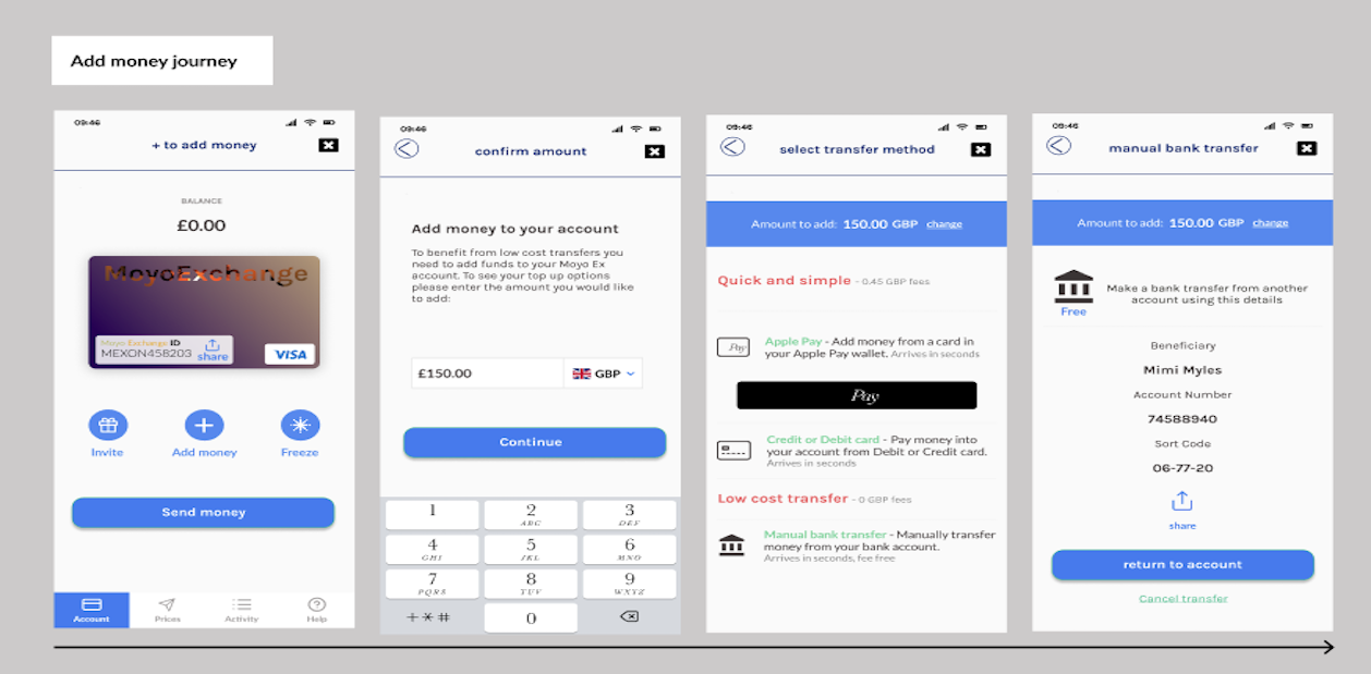
Add Money.
In the pursuit of optimizing user experience within Moyo Exchange, the critical factors that emerged were simplicity and intuitive design. These factors are particularly crucial when introducing the Moyo Exchange ID, which ensures seamless and cost-effective money transfers. I gained valuable insights into user expectations through concept testing, highlighting the importance of consistent labelling. This strategic approach establishes a cognitive framework that guides users efficiently through the platform's functionalities.
Furthermore, adding funds to the user's account is one of the foundational prerequisites for engaging with the platform's transfer services. Moyo Exchange brilliantly presents users with various options to fulfil this requirement. Whether opting for the convenience of Apple Pay, credit or debit card transactions (with a nominal fee) or choosing fee-free bank transfers by providing account details, the platform accommodates diverse preferences and financial needs. This diversity in funding options underscores the platform's commitment to user convenience and showcases its adaptability to the complexities of modern economic landscapes.

Send Money.
When it comes to setting up a user account, simplicity takes centre stage. With a few effortless taps on a mobile device, users can seamlessly establish their account while keeping it linked to their registered telephone number. However, that is not all. Picture the convenience of discovering that contacts who are already platform users effortlessly appear in your list of potential recipients. Their profile pictures are meticulously verified during sign-up using their IDs, eradicating guesswork, enhancing identification accuracy, and deterring fraudulent activities.
What if a family member or friend is absent from your current contacts list? No worries! Manually Adding them is simple, using their unique account ID. Enhancing the experience and confirming transfers with a secure passcode eliminates the risk of accidental transactions. Our progress animation offers real-time feedback: "Your money is on the way!" Furthermore, rest assured that you will automatically receive a reassuring text message on your registered phone.


Other miscellaneous journeys:
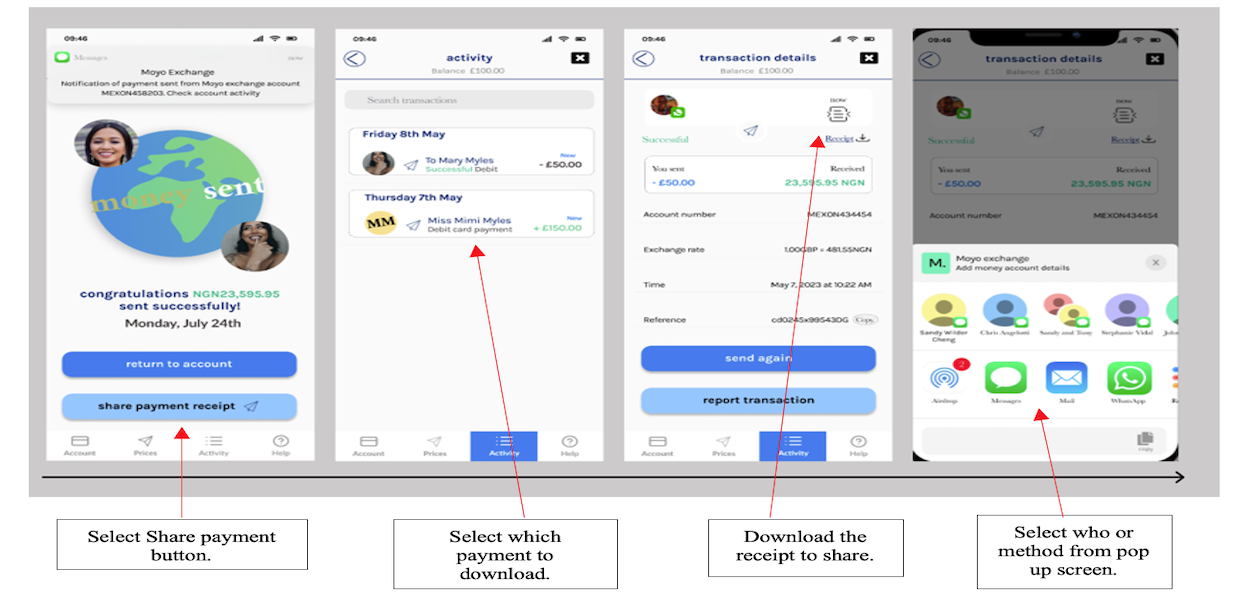
Sharing remittance receipt with the receiver.
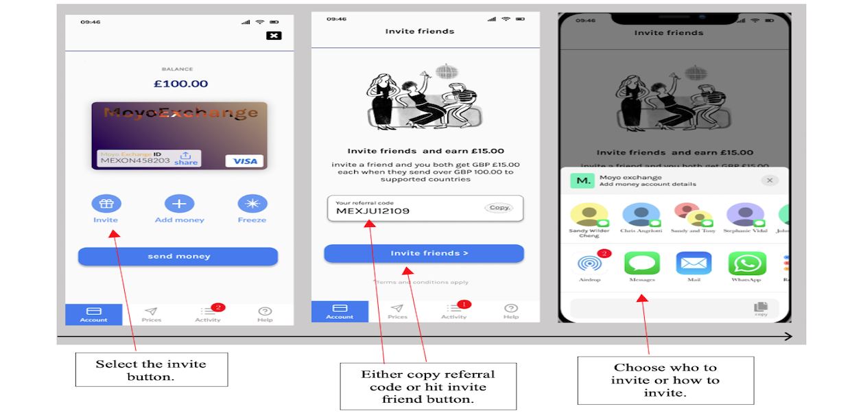
Friends and family are invited to join Moyo Exchange and earn a commission:
Get rewarded when you ask someone to join the app.
Try the clickable prototype HERE
Reflections & Next Steps…
At the end of the eight weeks of developing the moyo exchange prototype, i had successfully designed an MVP that provided solutions to the problems faced by Mimi and Mary.
I set clear expectations, chose target-driven workshops and managed my sprints effectively. The result would allow the product to go into development and further business goals.
I continue to learn how remittance platforms work and the security requirements and regulations needed to sign up a new user for a fintech product successfully.
The following steps and potential beta release features include the following:
Developing the user flow of a person receiving money for the first time.
Exploring how to motivate existing users to earn rewards by inviting new users to join the platform.
Exploring how users can freeze their Moyo Exchange account if suspicious activity is detected.
I am exploring the possibility of naming an account “guardian” that can freeze the account services of a relative/friend in the event of suspicious activity or death.
How to link/connect a Verve/bank cash card for African users and monitor activity through the app.
How to introduce and incorporate cryptocurrency trading or as a means to fund Moyo exchange account as Africa continues to lead in trading and using crypto, stable and fiat coins.
Conclusion.
As I delve further into the intricacies of remitting money to sub-Saharan African nations, this app design has been meticulously tailored to prioritise the user experience and its unique benefits to the sub-Saharan African user base. The core question of this design-focused project revolves around whether a remittance app centred around the specific needs of sub-Saharan African users while emphasising ease of use, accessibility, transparency, and security, all while incorporating Jakob Nielsen's design principles, can sway users away from informal channels toward formal ones.
I am confident that this app design has successfully achieved its objective. It has effectively addressed individuals like Mary and Mimi's challenges, using targeted workshops and efficient sprint management to meet their expectations. The result is a remittance solution that encourages the adoption of formal channels, enhances the user experience, and streamlines the onboarding process. This journey has deepened my understanding of the intricacies within the remittance domain, particularly the vital security protocols needed for fintech user registrations. Looking ahead, I am eager to refine the user flow for first-time money receivers and implement robust measures for account freezing in case of suspicious activities.