
It all starts with an idea!
Project Overview
CHALLENGE
Felicia's coffee shop has come to acknowledge the opportunity to expand its business and sales by accepting coffee orders through an app. The company needs a way to provide its customers with the ease of ordering coffee effectively and efficiently using an app designed and created solely for the business. There might be a need for complete rebranding, but she would want to take it in steps, so the App first and a responsive website soon.
SOLUTION
For this project, I will be designing a brand new app for Felicia's coffee shop. I conducted research and designed a responsive mobile app for ordering coffee with focus on an enjoyable experience for the user while addressing customers' needs.
Task
App to order coffee at workplace
Tools
Figma, Sketch, Mockflow, Miro, Canva.
Role
UX / UI Designer
Time
4 weeks
Design Process
Research
While I understood the services Felicia coffee shop offers, there was still a gap between my understanding of the app order and the walk-in customers. Therefore, before I could start brainstorming ideas, I needed to understand both better through thorough research.
Before diving into my research, I created a plan to define my research goals and outline the different methodologies I would use. Doing this allowed me to conduct my research with a clear direction and purpose.
Market Research
I started the research to familiarise myself with customers ordering coffee through an app. Through my research, I gathered information that helped me understand more deeply what the trends are and who the customers are. Here are some key findings from my study:
In 2018, 1.1 billion people purchased coffee using an app. In 2019, 1.5 billion. The trend for coffee app purchases continues to grow.
The second most popular beverage shopping category worldwide is coffee coming after water. People are downloading apps to buy coffee, which means there is a market for Felicia’s coffee shop app to enter and an opportunity for growth.
Top 5 reasons customers at a workplace will buy coffee through an app:
To save time & reduce downtime.
It supports ease of payment and accepts multiple payment options through the app.
It creates an efficient and effective workplace for all.
Delivers a better and more effective coffee order experience.
Solves the problem of employees wasting time on daily coffee runs to the shops.
Allows coffee customisation as needed
Remembers favourites and allows communications with actual Baristas making the coffee.
The largest percentage of app users is between 18-55 years in 2018 and, it continues to grow.
According to a Statista survey of people 18 years and above, 59% drink coffee in the workplace.
There was a decline in app coffee orders in 2020, but that was during to the pandemic and coffee shops closing down for health and safety reasons.
The coffee consumption rate is significantly higher in males (50.8%) than in females (32.8%)
A survey conducted in 2021 shows that there is a big shift after the pandemic in mobile app order, more than 26.4% of people have used a mobile pay and app to order coffee compare to 15% before it.
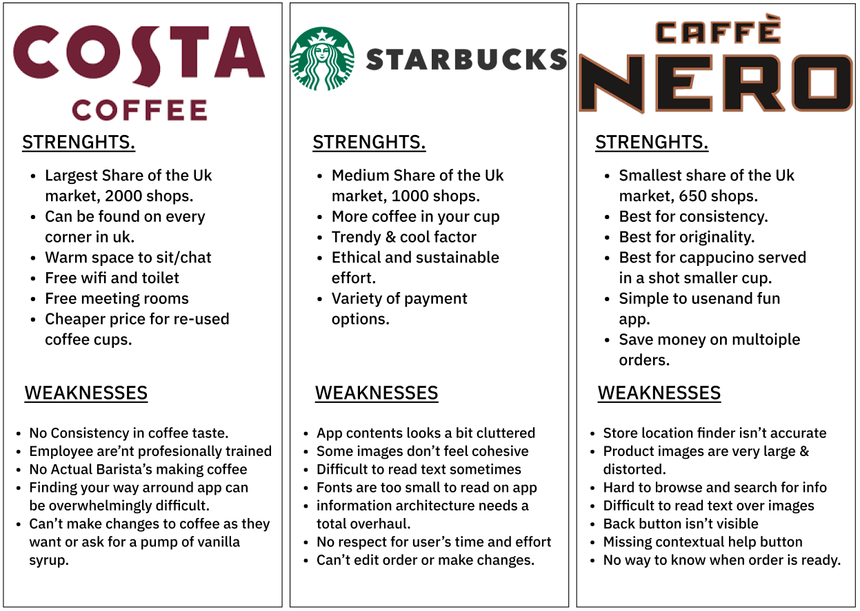
Competitive Analysis
After conducting my market research, I proceeded to analyze Felicia’s competitors to see what their strengths and weaknesses were. With this analysis, I was able to better understand the different approaches that these brands took in order to address a similar problem, and apply the information to help make the best decisions for Felicias coffee shop.
User Interviews
While I had a better understanding of the market, coffee shop competitors, and the general public, I wanted to dive more deeply into Felicia’s coffee shops customers buying habits and understand - who exactly the customers are and, what have their coffee buying experiences been like? Now it was time to conduct user interviews to start learning more about the app users / customers.
Five people that fits into the demographics I identified in my research were carefully selected and interviewed. In these interviews, I focused on asking open-ended questions, keeping the research goals plan in mind:
Identify what will motivate a customer / customers to use mobile app vs. visiting the store to make purchases?
Discover the pain points customers encounter when buying coffee as a walk-in customer.
Determine what factors into a great coffee buying experience through an app .
Identify Felicia’s coffee shop competitors in the area and evaluate their strengths and weaknesses,
After gathering all these information from the interviews, it was now time to do a deeper dive analysis by using an empathy map.
Empathy Map
I gathered all the evidence I came across during the interviews and wrote all the meaningful ones on sticky notes to separate them into segments of what the customers say, think, do and feel. Then I organised them into categories which helped me get a better overview of all the information gathered from the users I interviewed.
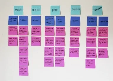
When looking at all the notes, patterns emerged across the different categories, allowing me to draw critical insights from them. The most prominent patterns that I discovered were the following:
CONVENIENCE
Ability to make purchase from the comfort of their office using an app.
App is generally helpful to user and a joy to use.
Ability to make quick purchase because app uses AI to recognise frequent orders and store them in favourites.
App order allows user to spend more time been productive rather than waste time on coffee runs and app orders.
Eliminates waiting in line to pick up orders.
ALERTS, MESSAGES & PRODUCTIVITY
Receive alerts of time to pick up purchased coffee.
Alerts user of number on line before placing orders should in case of hurry.
Communication with the actual Barista preparing coffee.
Reduces time wasted on coffee runs.
Enhances productivity at work.
Allows customer to express appreciation and write reviews or suggest improvements.
PAYMENT, PICK-UP, PREFERENCE
Supports the ease of payment and accepts multiple payment methods.
Ability to customise coffee to how customers like it.
Ability to order coffee in advance.
Have an opinion or suggestion, express it and shop will listen.
Ask a friend to pick-up for your, just forward your QR code to him/her.
Allows user to choose condiments type.
And now, what do these patterns mean?
Here are the key insights I drew from these patterns and the users’ needs that I was now able to understand from those insights:
Insights
People are motivated to buy coffee knowing they aren’t going to wait in line when they get there.
People are likely to buy coffee because of the convenience of ordering and paying through their app.
People want to pick up their coffee purchase in an effective and timely manner.
People are motivated to order coffee knowing that it will be made to their satisfaction.
People are motivated to order coffee knowing they will be rewarded with free coffee after few orders.
People are motivated to order coffee knowing it will be made by a properly trained Barista.
People are motivated to order coffee knowing it will taste the same all the time.
Needs
To know they their coffee order request is been met.
To know that Coffee order favourites will be remembered and saved on app automatically.
To know that method of payment will be securely kept.
To know that the App will send notification to pick up coffee when it’s ready.
To know that the App will allows customer to view their number on queue before committing to purchase should in case they are in a hurry.
To Know that customer can mute app notifications and communications.
To know that coffee orders will be ready when user get there to pick up.
Storyboard
I now have a solid understanding of the users’ needs, but I wanted to dive deeply into the users’ overall coffee buying experience. What motivations and frustrations do these users have during their coffee buying experience?
Creating this storyboard allowed me to visualize the user’s environment and the motivations and frustrations throughout that experience:

Persona
With a well-rounded understanding of the user’s goals, needs, motivations, and frustrations, we can now meet Victoria, the user persona that was created based on all the insights gained from my research. With this persona, I continued to ensure that I was designing for Victoria throughout the process.
Meet Victoria,

DEFINE
Defining the Problems
Based on my research synthesis, I began defining the core problems that needed to be solved and laying out the strategy to come up with solutions.
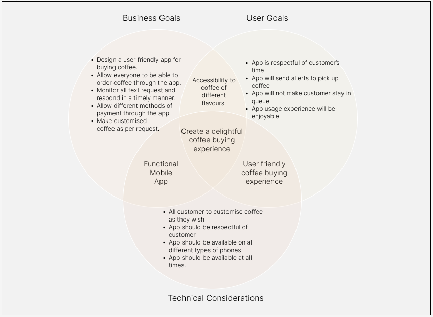
Project Goals
To start this process, I created a Venn diagram outlining the different goals between the business and the customers and some technical considerations to keep in mind. Defining and understanding the individual and larger project goals helped pave a more precise path when making decisions throughout the design process. In addition, understanding the different approaches taken, addressing similar problems, and applying the information will help make the best decisions for Felicia’s coffee shop.
Now that I understood the goals, I started thinking about what features would be needed to achieve these goals. To help organize and plan these features, I created a feature roadmap.
Feature Roadmap
Looking back on my research findings, I put together a list of features that Felicia's coffee shop app would need and then prioritized them based on what was more important to meet the project goals.
Now that I understood what features would be vital in meeting the project goals, I wanted to start exploring the overall architecture of the app designs. How can we organize, structure, and lay out all the information and features on the app to meet the goal of creating a delightful coffee-buying experience for the users?
Card Sorting
Because Felicia's coffee shop app has a relatively large inventory of items, it is crucial to provide a clear path for the users to navigate through it to give the best experience, making sure the users can find what they are looking for. So I set out to better understand this by conducting a card sorting session.
I conducted an online, open card sort remotely with 10 participants within the building of the coffee shop but with different companies using OptimalSort to observe how people naturally like their coffee. This study discovered that the most common trend was sorting the coffee by type (Cappucino, Latte, Americano, etc.). Using this information, I could continue to work on the information architecture of Felicia's new coffee shop app by creating a site map.
Site Map
Now that I knew how people expected to see the different types of coffee organized, I also went on to do more research by looking at what the common trends are for navigating competitors' apps. Then, using this information gathered, I put together a site map to outline the organization of all the content on Felicia's apps and to show the relationship between the different pages.

IDEATE
Ideating Solutions
I knew what kind of beverage I could purchase using Felicia's coffee shop app now based on the site map, but how will the customers be interacting with the app purchase? So, before I started working on the app's design, I wanted to understand how users would be using Felicia's coffee shop app and meeting their goals.
Task Flows
To better understand how users would be completing essential tasks using the app, I started by creating task flows. Creating these task flows helped me identify the critical tasks the users would complete and the key screens that users would be interacting with.

Victoria was tired from working till late last night; she was up late to prepare for a meeting with an important client. The meeting starts in 30 minutes, and she could use a coffee; she wants to order coffee from her desk while finalizing the preparation for her appointment. she can only spare 5-7 minutes to pick up coffee and go into her meeting with her visiting client. Advised them to use Felicia's coffee shop app, and she will be fine.
User Flow
Diving deeper, I created a user flow exploring different scenarios for my persona, Victoria. Here I explored the different paths Victoria would take while interacting with the App and identified the key pages and features with which she would interact.

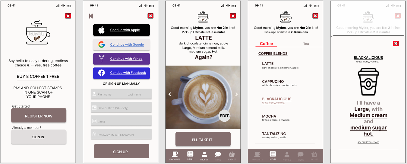
Sketches & Wireframes
At this point, I started sketching different ideas for Felicia’s coffee shop’s app design layout to reflect Victoria’s needs and the common design patterns I researched on other coffee shops’ apps. After choosing the one that best fits Felicia’s coffee shop goals and requirements, I worked on digital versions of some of the key pages to solidify the app design layout. Finally, I ensured it was responsive to ensure the structure was fluid across different devices.

UI Design
I started crafting the visual design of the critical app pages based on the wireframes I had created earlier. Here I focused on how Felicia’s coffee shop app would translate and use the designs for the next step - building a prototype to test.
PROTOTYPE
Application Prototype
Using the pages I designed in Mockflow, I used Figma to build a hi-fidelity, limited functionality prototype for usability testing in order to observe how users interact with the site and identify where improvements could be made.
TEST
Testing the Design
Before I dove into the testing, I created a test plan to fully understand and be prepared for how it would be conducted. I then recruited participants and began to test my design to observe how users interacted with it and to identify how I could improve the design. Because meeting people in person was difficult at the time of the project, I conducted a moderated, remote, think-aloud usability test with 6 participants who fit the criteria I was looking for.
Usability Testing Overview
Objectives
Test if users can efficiently complete the tasks.
Observe the different paths users take to achieve the same tasks.
Assess areas of improvement for future iterations of the design.
Participants
6 participants.
Enjoys take out or coffee on the go
Is aged between 22-60 years old.
Has a job in an office environment, not work from home.
Have used an app to make a coffee purchase in the past.
Affinity Map
I used an affinity map with all my observations to analyze the insights gained during the usability testing. This allowed me to uncover patterns across the different participants' experiences and identify what improvements I should make to the app prototype.
I first grouped the sticky notes by each participant to get an overview of all the observations made during testing. Then, I grouped them by common patterns I noticed amongst the participants to draw insights from the information I gathered.
Key Patterns
6/6 participants completed the checkout process error-free
4/6 participants manually scrolled through all products and made coffee to their satisfaction.
2/6 participants (2/4 of the manual scrollers) looked at the favourite menu but did not realize it would come into effect after ordering the same coffee a few times.
2/6 participants had trouble selecting condiments and cup sizes*
3/6 participants ran into some confusion when trying to navigate between coffee blends and tea blends*
*Pains identified during testing
From the pains discovered from the testing, I drew the following insights, which helped me identify what design improvements I should prioritize
Insights
People expect to see daily specials in favourites not knowing that they could actually add their own specials or it will be added after few orders of the same coffee using apps built in intelligence.
Some people had difficulty selecting condiments.
People overlooked the filter feature and just order as is.
Some people did not know what size of coffee they were ordering.
Some people did not know you could actually text the barista making the coffee for special instructions or simply express appreciation.

Design Recommendations
Brief message to inform the user when they click on the favourite button and have nothing there showing.
Add more contrast in the design to help the user understand how to toggle between tea and coffee blends.
The customer must select the coffee size before adding it to the basket and checkout.
Simplify and add more contrast to the condiments feature to make it easier for the users to see/find.
Priority Revisions
Using what I learned from the usability testing, I made revisions to my design and created the final prototype.
No info button added to the (before)
Quick info added (After)
This project helped me learn the critical role that research and testing play in building a product that provides a solution to not only what the users think they want but something that the user truly needs. If I were to push this project further, here are the next steps I would take:
RE-TEST THE CHANGES
Though I made design changes based on insights gained from the affinity map, I want to validate that these improvements are indeed improvements to the overall design.
DESIGN HANDOFF & QUALITY ASSURANCE.
After a final design version is completed, I would hand this off to the developers or other stakeholders to start building the product and be available for questions and directions for quality assurance.
PRODUCT LAUNCH
Finally, once the product build is developed, we will launch the final product: Felicia's coffee shop's new app experience.