
Moyo.Exchange
Bridging the Financial Trust Gap in Sub-Saharan Africa
01 | The Context: Beyond the Numbers
While the World Bank reports a $49.1 billion surge in remittances to Sub-Saharan Africa, the human story is more complex. Immigrants working in the UK and abroad are forced into "informal" channels because existing apps are cumbersome, culturally disconnected, and expensive (averaging 6.4% in fees).
The Challenge: How can we apply Jakob Nielsen’s Design Principles to build a formal remittance tool that feels as trustworthy and intuitive as a conversation with a family member?
Role: Lead Product Designer
Methodology: Double Diamond x Agile Sprints x Design Thinking
Tools: Figma, Miro, Zoom, Otter.ai, Google Forms

02 | Discovery & Strategic Synthesis
The research phase was a methodical exercise in data synthesis. My goal was to move beyond surface-level observations and uncover the root causes of user friction in the remittance market. To ensure no insight was lost and that the process was both collaborative and auditable, I utilised a professional UX tech stack.
The Tools of Discovery
Market Benchmarking (Competitive Audit): I conducted a comparative analysis of traditional giants like Western Union versus fintech disruptors such as LemFi and Wise. My objective was to evaluate their onboarding flows and fee transparency.
The Business Insight: While incumbents have global reach, they lack the regional nuance and user-centricity required to win the trust of the Sub-Saharan African diaspora.
Primary Research (Zoom & Otter.ai): I conducted deep-dive interviews with five frequent remittance users. By utilizing Otter.ai, I generated live transcriptions, which allowed me to remain fully engaged with the participants while ensuring every verbal and emotional nuance was captured for later analysis.
Quantitative Benchmarking: I utilized task completion data to provide a baseline for optimizing the end-to-end journey and set measurable UX goals.
Data Organization & Synthesis (Miro): I migrated all qualitative findings into Miro to build an Empathy Map. This allowed me to categorize raw data into what users say, think, do, and feel, bridging the gap between raw interview transcripts and actionable design requirements.
Balancing User Desirability with Business Viability
The Strategic Conflict: The business requires rigorous KYC/AML compliance, but users find ID verification intrusive and frustrating.
The UX Solution I leveraged Behavioural Design principles to mitigate friction. Instead of a static form, I designed a conversational onboarding flow using progressive disclosure. This ensures that sweating the details leads to a high-trust experience.
Strategic Implementation & Alignment: Acting as a Lead Designer, I facilitated design sprints to align strategy with technical constraints. By connecting the dots between regulatory requirements and user motivations, I transitioned the project into a cohesive vision.
03 | Defining the Human Ecosystems (Personas)
To craft a cohesive vision, I meticulously defined the dual ends of the remittance journey. By mapping the relationship between the Sender and the Receiver, I identified how design could solve for behavioural motivations on both sides of the platform.

Persona A: Mimi (The Sender)
Profile: Auxiliary nurse and single mother.
The Challenge: High cognitive load and a "pioneer mindset" for digital tools that save time.
Strategic Need: Transactional confidence through real-time notifications and pixel-perfect receipt sharing.

Persona B: Mary (The Receiver)
Profile: Rural educator and grandmother.
The Challenge: Navigating "live experience challenges" where digital delays have physical safety consequences.
Strategic Need: Direct-to-wallet integration to eliminate the friction and danger of physical bank visits.
The Synthesis: This mapping allowed me to set direction for the product, shifting the focus from a simple transfer tool to a behavioural design solution that prioritises safety, trust, and transparency.
04 | Strategic Alignment: Systems Thinking in Action
To transition from discovery to definition, I facilitated a series of Design Workshops rooted in the Double Diamond framework. My goal was to ensure the product strategy remained fan-first while addressing the rigorous technical and regulatory requirements of the fintech space.
The "Win-Win" Strategy (Convergent Thinking)
Business Viability: Achieving high conversion rates and KYC (ID verification) compliance.
User Desirability: Ensuring transparency and minimising cognitive load during high-friction tasks.
The Behavioural Solution: I implemented Progressive Disclosure. By delivering value (Price Comparison) before requesting effort (ID Verification), we build user trust before they reach the highest point of friction.
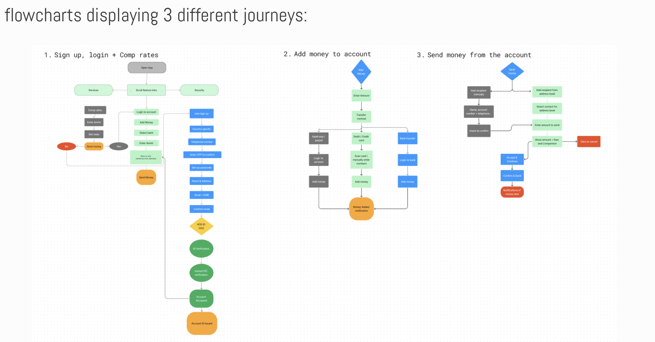
Strategic Flow Definition (The Flowchart)
I developed comprehensive flowcharts to map three critical user journeys: Onboarding/KYC, Fund Liquidity, and the Core Remittance Transaction. This exercise allowed me to identify and eliminate potential 'dead-ends,' ensuring a frictionless transition from anonymous browsing to verified transacting.
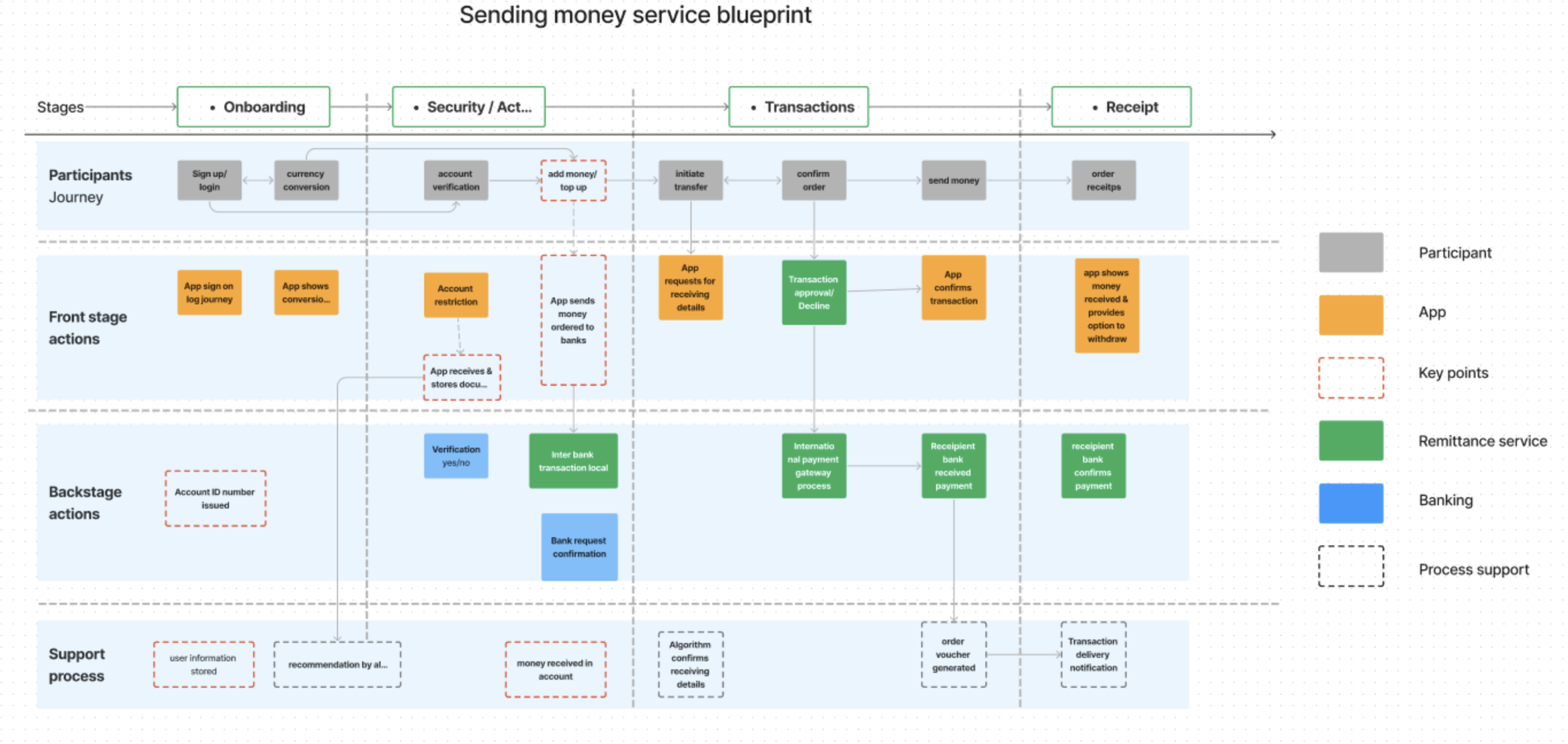
Service Design & Ecosystem Integrity (The Blueprint)
To ensure the product was technically viable, I moved beyond the interface to create a Service Design Blueprint. This holistic map connects the 'Front Stage' user experience directly to the 'Backstage' technical infrastructure including API calls for bank verification, international payment gateways, and automated support processes. This level of Systems Thinking allowed me to identify exactly where technical latency might disrupt the user’s sense of safety, enabling the design of proactive notifications for every stage of the journey.
05 | Ideation & "Fail Fast" Testing
I facilitated "How Might We" (HMW) sessions to pivot from abstract pain points to functional, data-backed features. By integrating Agile workflows, I led rapid prototyping and user testing cycles to validate my hypotheses before committing to high-fidelity development.
Strategic HMW Questions
Incentivising Value: HMW allows users to compare rates without the friction of a full sign-up.
Humanising Compliance: How can HMW make complex KYC (ID verification) feel welcoming rather than intrusive?
Optimising Utility: HMW display the "Moyo ID" to maximise shareability within the mobile ecosystem?
The "Moyo ID" Experiment & UX Pivot
Using the Crazy 8s sketching method in Miro, I explored the "Moyo ID" puzzle designing a unique digital address for users. I tested three distinct UI variations to identify the most intuitive interaction model.
The Behavioural Result
By standardising terminology from "Wallet Number" to "Moyo Exchange ID," I reduced cognitive load and aligned the interface with existing financial mental models. This data-driven pivot ensured that pixel-perfect interfaces were backed by quantifiable user success metrics.


Screen 1: The Baseline (Control)
Concept 1: The ID was placed in the top-left corner with an 'info' icon. Testing proved this was the least intuitive, with only a 19% preference. The iconography failed to trigger the user's mental model for 'sharing'.

Screen 2: The Multi-Step Approach
Concept 2: A direct but secondary-page approach. While 29% found it clear, it introduced unnecessary friction by requiring an extra click. This helped us move toward a 'one-tap' philosophy.

Screen 3: The Strategic Winner (The Thumb Zone)
Concept 3: By applying Human-Centered Design (HCD) principles, I moved the ID to the lower 'Thumb Zone' and added a clear 'Share' label. This resulted in a 52% increase in sharing efficiency and became the standard for the final product.
06 | High-Fidelity: From Friction to Flow
I developed a scalable Design System in Figma, balancing modern minimalism with a distinct African cultural identity. By sweating the details of the visual language, I ensured the platform felt both professional and deeply personal to the Sub-Saharan diaspora.
Visual Direction & System Architecture
Brand Identity: "Moyo" (meaning 'Heart' or 'I Rejoice') utilises generous white space paired with vibrant regional accents.
Grid Integrity: I utilised a 6-column iOS grid system to maintain rigorous design consistency across all screens, ensuring a high-quality experience regardless of device.
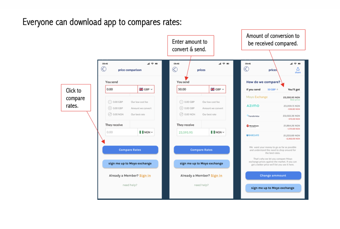
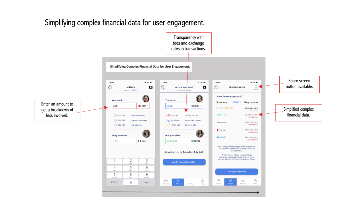
1. Simplifying Financial Complexity
The Insight: Complex fee structures and exchange rates caused cognitive overload.
The Iteration: Redesigned financial data into clear, actionable formats. I emphasised transparency so users can share transaction details with family instantly, with no sign-up required for the receiver.
User Win: Empowerment through financial education and clarity.
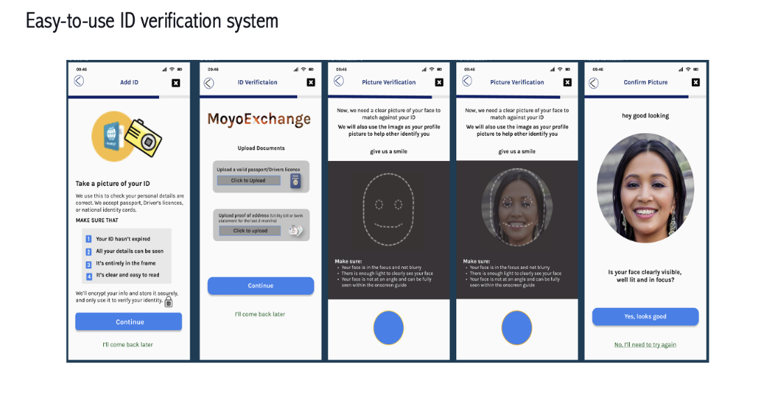
2. Effortless ID Verification (KYC)
The Insight: Identity verification felt like a "hurdle" that triggered anxiety.
The Iteration: Streamlined the ID upload and live-photo process to be frictionless. I replaced technical jargon with clear, supportive instructions.
Business Win: Meets strict legal compliance without sacrificing user conversion.
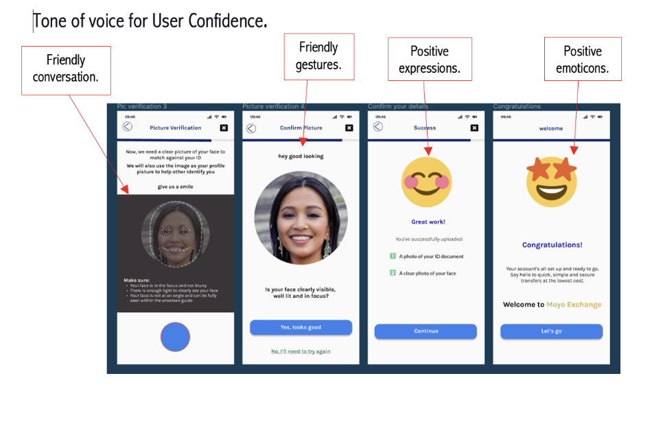
3. Conversational Tone & Trust
The Insight: A cold, corporate tone made users wary of sharing sensitive data.
The Iteration: Adopted a friendly, conversational tone using supportive emojis and approachable language (backed by UX Collective studies on emoji usage).
Balance: I balanced this "warmth" with high-security cues (passcodes and progress animations) to ensure users felt both welcome and safe.
07 | Validation & Core Journeys
To validate the cohesive vision, I conducted moderated usability testing with 5 participants. This ensured that sweating the details in the architecture phase led to a high-trust, 100% task completion experience.
Conversational Onboarding: Users felt the flow was a "dialogue," reducing the friction of KYC compliance.
The "Zero-Anxiety" Transfer: By integrating verified photos, I eliminated "sender anxiety", a critical behavioural pain point.
08 | visual identity & design system
To ensure pixel-perfect execution across a global ecosystem, I developed a comprehensive Design System that bridges the gap between cultural heritage and enterprise-grade usability.
The Strategic Pivot: Heritage vs. Usability
My initial exploration featured vibrant African patterns, but usability benchmarking revealed they increased cognitive load during high-stakes financial transactions. I led a strategic pivot to align the aesthetic with ISO 9241 standards, focusing on "Transactional Calm."
Generous White Space: Implemented to reduce visual noise and allow users to focus on critical data points like exchange rates and fee transparency.
Subtle Cultural Cues: I utilised a refined palette inspired by regional flags, maintaining a "local" feel that builds transactional confidence without sacrificing the clarity required for a professional financial tool.
Meaningful Branding: The name "Moyo" (Yoruba for "I Rejoice") was chosen to evoke the joy of communal support. This cohesive vision ensures the brand resonates emotionally with the Sub-Saharan diaspora.
System Architecture & Regional Logic
Acting as a Lead Designer, I ensured the system was flexible enough to handle diverse infrastructure constraints:
Strategic Minimalism: High contrast and clear typography were used to meet WCAG 2.1 accessibility standards for all demographics.
Global Interchangeability: I designed the flows to adapt dynamically between UK-based Visa users and Africa-based Verve/Mobile Money users, ensuring a seamless "end-to-end journey" regardless of the local banking ecosystem.
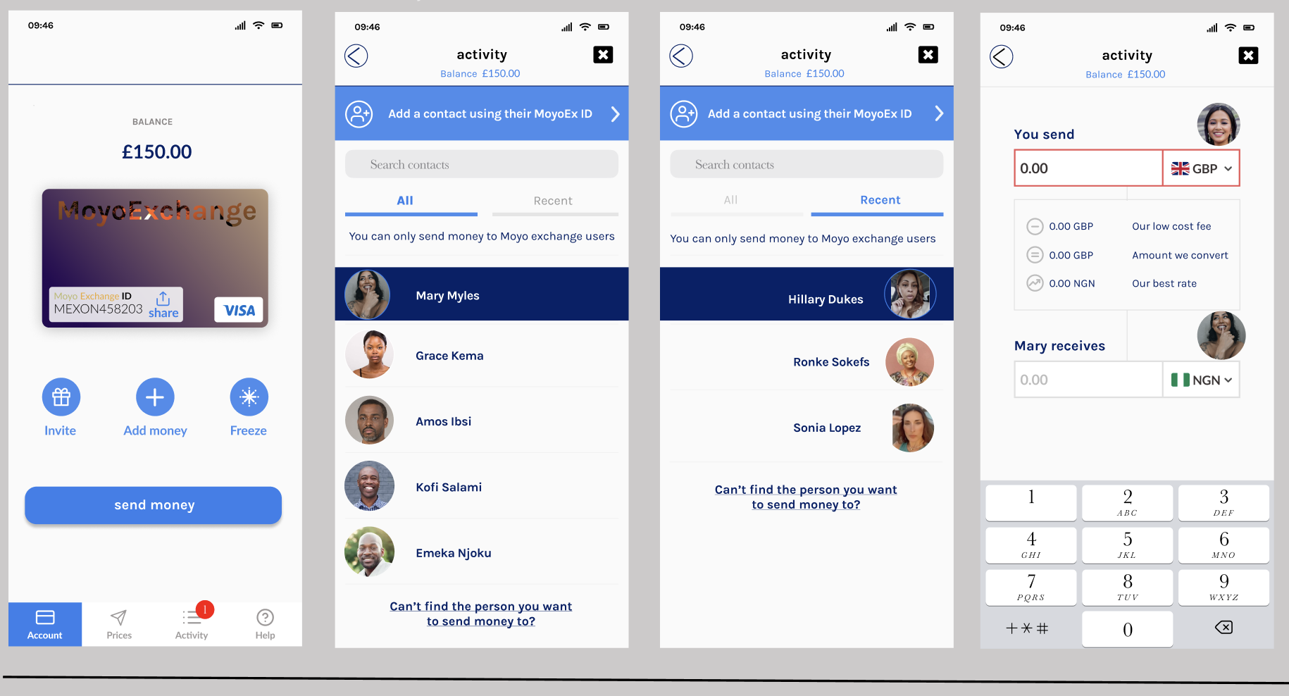
09 | The Core User Journeys
Following the validation of my Service Blueprint, I developed the final high-fidelity interface. My focus was on "sweating the details" to ensure every interaction reinforced a cohesive vision of trust and efficiency.
Human-Centred Onboarding (The Compliance Challenge)
Creating an account is the highest-friction point due to mandatory ID verification. I broke the process into bite-sized steps using Progressive Disclosure and a welcoming tone of voice to motivate users through live-photo checks.
The Result: A secure, compliant process that feels like a conversation, not an interrogation.

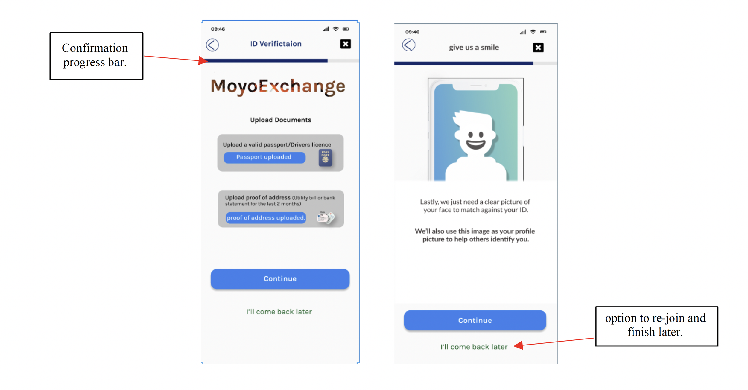
2. The Save & Resume Strategy (Conversion Optimisation).
In fintech, ID verification (KYC) is the industry's biggest 'leaky bucket', the point where user drop-off is highest due to external friction (e.g., searching for a passport, or being interrupted). Instead of forcing users to restart the journey if they abandon it, I designed a 'Save & Resume' logic.
Progressive Context: A persistent progress bar keeps the user oriented during the multi-step verification process.
User Agency: The 'I’ll come back later' CTA provides an explicit 'out' for the user.
The Business Outcome: From a product perspective, this is session management. By allowing the user to pause, we capture their intent rather than losing them to a competitor. We move from a rigid, 'all-or-nothing' flow to a conversational one that respects the user’s time.
This design choice proves that my focus isn't just on making the UI 'look' complete, but on protecting the business's conversion metrics and maximizing the total addressable audience for the product.
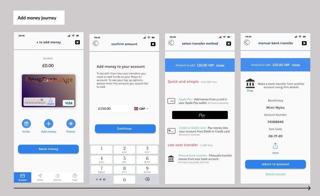
3. Frictionless Funding (The Liquidity Journey)
To maximize accessibility, I designed a multi-channel funding interface that allows users to choose between Apple Pay, cards, or fee-free transfers.
The Strategy: By standardising the "Moyo Exchange ID" label, I built a reliable mental model that helps users understand exactly how their digital wallet is identified globally.
4. Peer-to-Peer Transfers (Eliminating "Sender Anxiety").
The transfer journey was designed to solve the emotional pain point of "sender anxiety", the lack of clarity during the transit phase of a payment.
The Strategy: To eliminate this uncertainty, I designed a real-time notification loop that provides end-to-end traceability, mirroring the performance standards of modern cross-border networks like Swift gpi Instant.
The Innovation: The app utilises Smart Syncing to identify existing users with verified photos, providing instant visual confirmation the moment settlement occurs. By providing this 'Transactional Calm,' I successfully transformed a complex, behind-the-scenes financial settlement into a human-scale interaction, reinforcing the platform's reliability and building the trust required to displace informal payment channels.
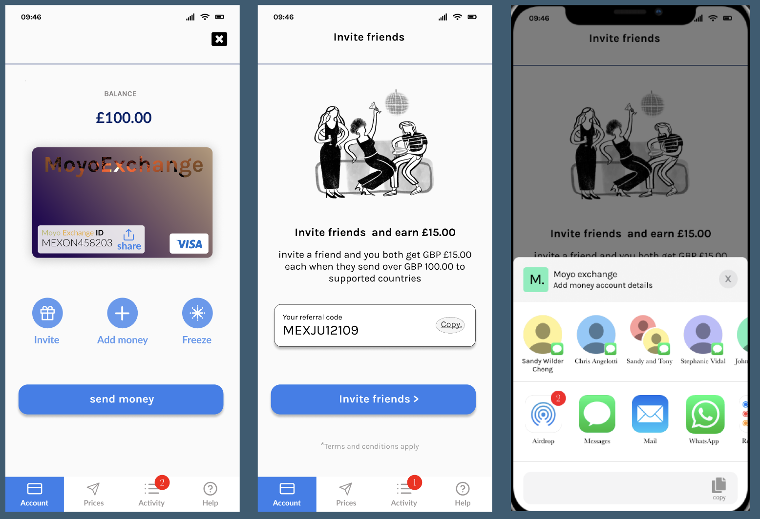
5. Community Growth (The Viral Loop)
To support business growth, I designed a seamless referral loop. By providing Social Proof through easy receipt sharing and clear referral CTAs, I ensured that the product could grow organically while rewarding the community.
10 | Reflections & Future Roadmap
Project Retrospective: From Ambiguity to Impact
In eight weeks, I moved from identifying a critical market gap to delivering a high-fidelity MVP that directly addresses the pain points of the Sub-Saharan diaspora. By facilitating target-driven workshops and managing Agile sprints, I delivered a solution that is both user-centered and technically business-ready.
Fintech & Compliance Literacy: I gained a deep understanding of the regulatory landscape and the rigorous security protocols required for successful KYC onboarding.
Cultural Nuance vs. Standard UI: I learned that while cultural connection is vital for trust, it must never compromise the functional clarity of a financial tool, a balance achieved through rigorous A/B testing.
Process Leadership: Successful delivery relied on setting clear expectations and using the Double Diamond framework to maintain focus under high-velocity timelines.
The Road Ahead: Strategic Evolution
To further elevate the Moyo Exchange ecosystem and "connect the dots" across the fintech vertical, I have identified these strategic next steps for the beta release:
The "Receiver" Experience: Designing a dedicated onboarding flow specifically for first-time fund recipients in Sub-Saharan Africa to close the "trust loop."
Security & Safeguarding: Implementing "Guardian Accounts," a feature allowing trusted relatives to freeze services during suspicious activity, enhancing safety in the live experience.
Alternative Funding: Exploring the integration of stablecoins and cryptocurrency, aligning with the rapid digital asset adoption across the African continent.
Conclusion: A New Standard for Remittance
Can a remittance app move users from informal channels to formal ones? By prioritizing Transparency, Cultural Familiarity, and Jakob Nielsen’s Heuristics, Moyo Exchange proves it is possible.
The resulting design addresses the historical "lack of comprehension" in the industry, offering a pixel-perfect, secure, and joyful experience that turns a complex financial chore into a moment of human connection.