Salesforce UX Strategy.
Scaling enterprise adoption through Salesforce Lightning Design System (SLDS) and AI-driven automation.
Project 1: Optimizing Account Console for High-Velocity Teams
Platform: Salesforce Lightning Design systems (SLDS)
Objective: Redesign the standard Salesforce Account Record Page to reduce "toggle tax" and improve data accessibility for both Desktop and Mobile users.
1. The Challenge (The "Why")
Standard CRM interfaces often suffer from "information overload," where critical data is buried under deep scrolls or hidden tabs. My goal was to architect a persona-based record page that prioritizes immediate action (Activities) while keeping historical data (Related Lists) and deep-dive info (Details) organized and accessible.
2. Technical Solution (The "How")
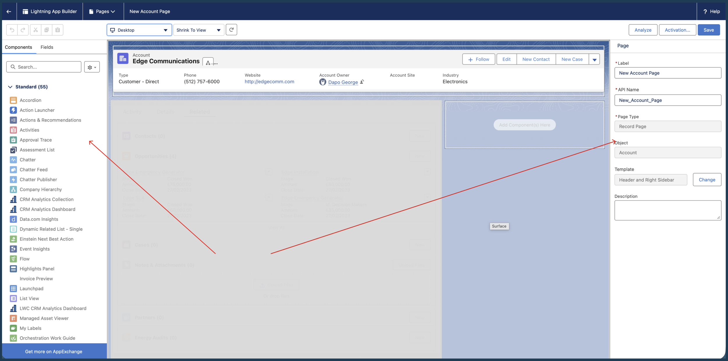
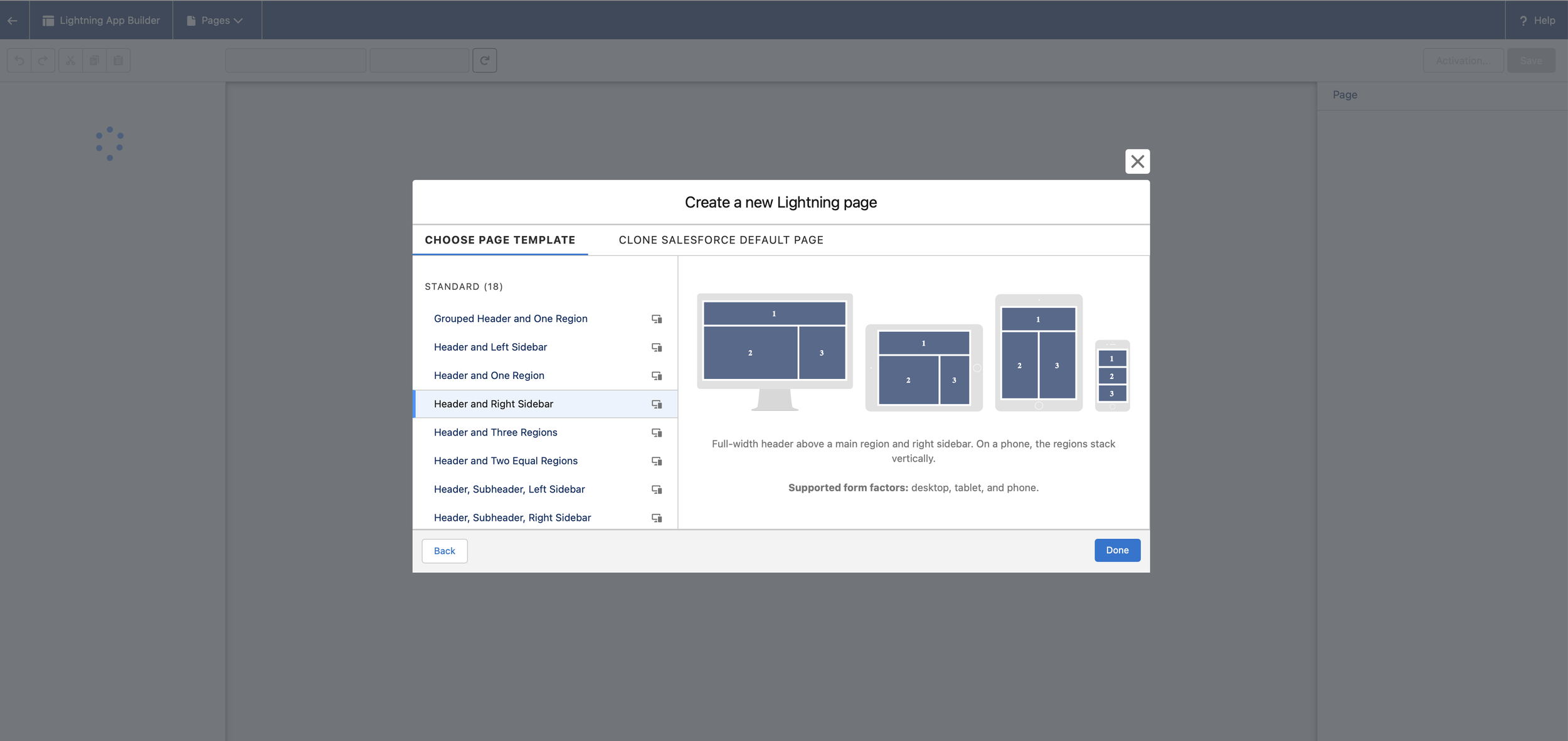
I utilized the Salesforce Lightning App Builder to construct a "Header and Right Sidebar" layout. This architectural choice ensures that the most critical real-time information is always visible in the "F-pattern" reading zone.
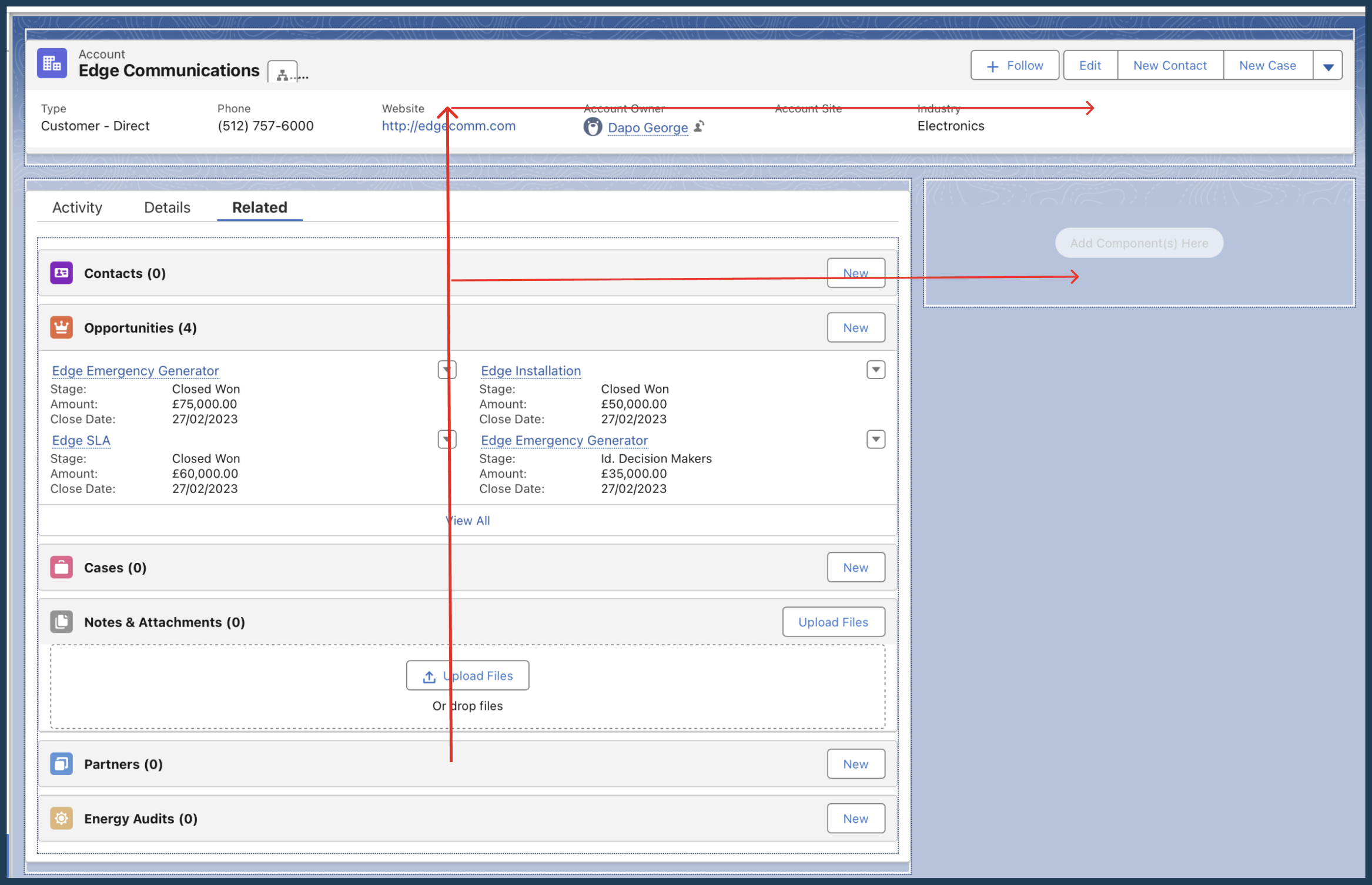
Global Highlights Panel: I implemented a top-level Highlights Panel to give users an instant "360-degree view" of the Account without clicking a single tab.
Prioritized Information Architecture: I restructured the Tab component to lead with the Activity Tab.
UX Rationale: In account management, "What do I need to do next?" is more important than "What are the account details?" Lead with action.
Dual-Device Optimization: I activated the page for both Desktop and Mobile, ensuring that the layout remains functional for field-based users who need to log activities on the go.
3. the "UI Focus"
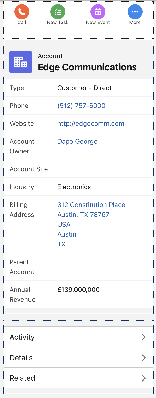
Desktop View: Shows the full layout. The "F-Pattern" of the Highlights Panel and the Activity Tab.
Mobile View: "The Header and Right Sidebar" template collapses gracefully into a single-column mobile view. (This proves and shows the Design is Responsive.)
Behind the Scenes: Below is a screenshot of the Lightning App Builder interface, showing the technical configuration, not just a visual design tool.
4. design Logic.
my Insight as the “ux designer” (The "So What?")
While this was a technical configuration, the core design philosophy was Cognitive Load Reduction. By separating Activities from Record Details, I've reduced the time-to-task for Account Managers, allowing them to focus on the customer relationship rather than navigating the CRM.
Usability Upgrade for Complex Data.
Project 2: Enhancing Enterprise Data Scalability with Dynamic Forms
Platform: Salesforce Lightning (SLDS)
Key Focus: Interaction Design, Data Density Management, Mobile Parity.
1. The Challenge: Solving "Field Fatigue"
In large scale enterprise environments, Account records often contain hundreds of fields. A static "Record Detail" page forces users to scroll endlessly to find what they need. My objective was to upgrade a standard Account page to Dynamic Forms to create a modular, high-performance experience that prioritizes only the most relevant data.
2. The Solution: Contextual Data Architecture
I transitioned the page from a rigid, monolithic layout to a flexible, component based architecture.
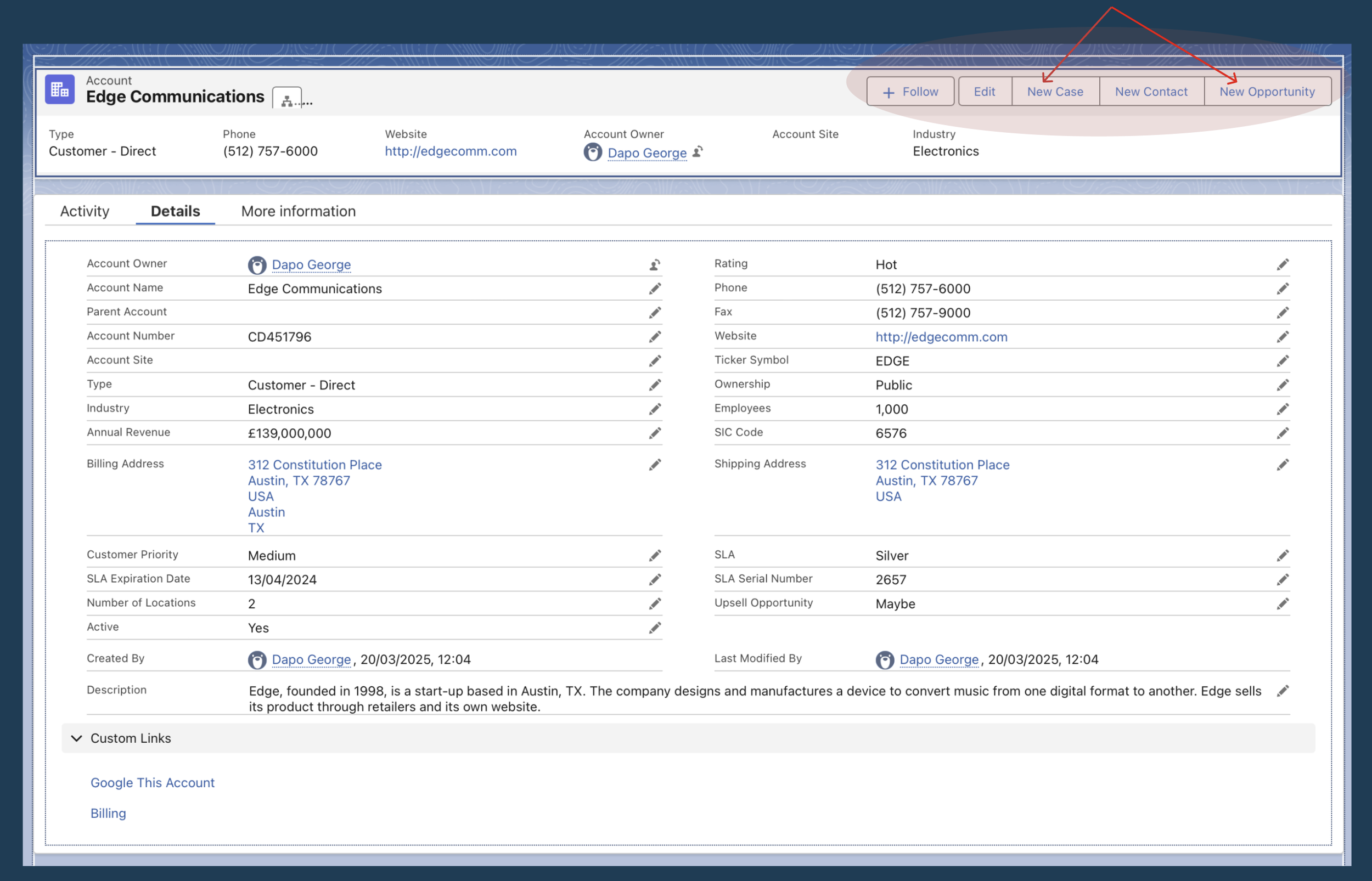
Dynamic Highlights Panel: I replaced the static header with a Dynamic Highlights Panel.
UX Strategy: I curated a specific set of 5 "Power Fields" (Type, Industry, Phone, Rating, Owner) and 4 "Critical Actions" (Edit, New Case, etc.). This ensures that 80% of a user's tasks can be completed from the top 10% of the page.
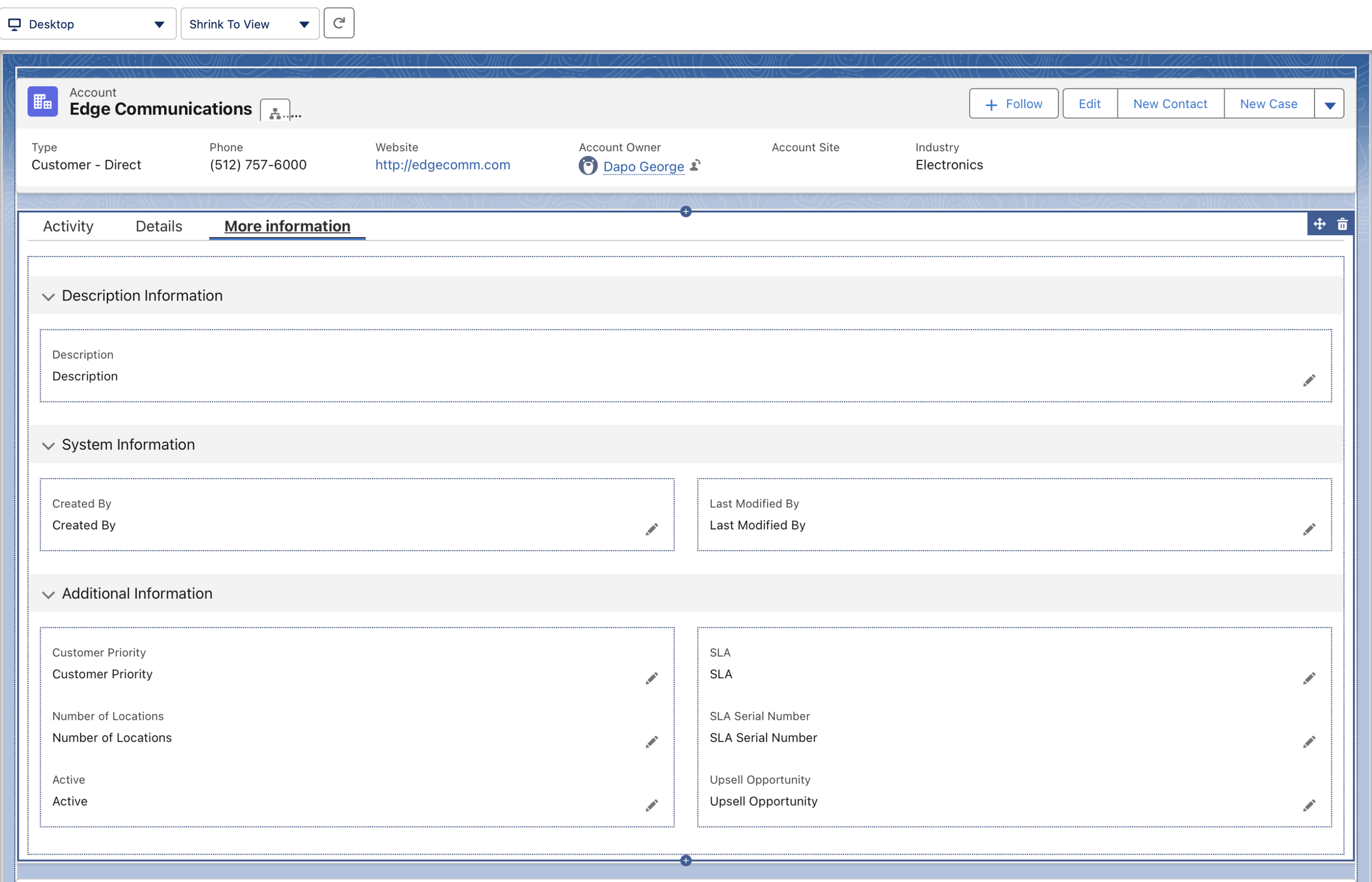
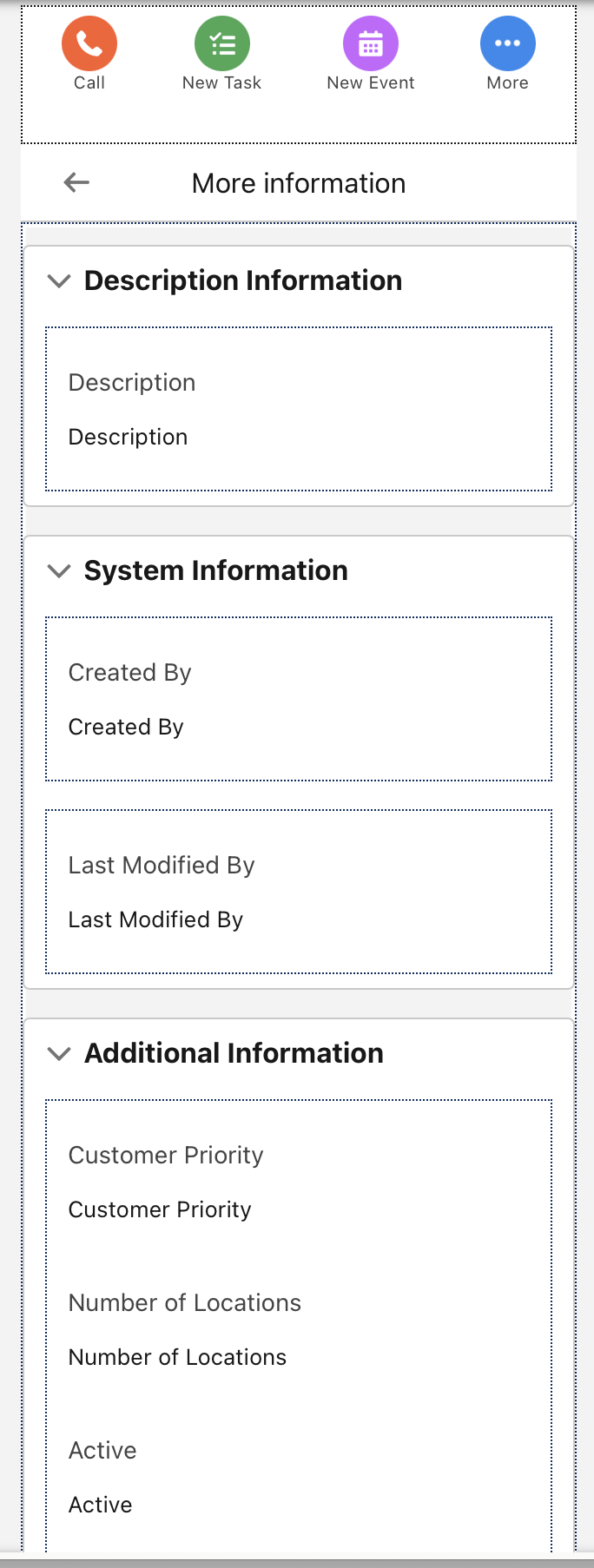
Progressive Disclosure via Tabs: I added a "More Information" tab to house low-frequency data (System and Description Info).
UX Strategy: By moving "metadata" out of the primary view, I reduced the cognitive load on the main page while keeping the information one click away.
Clutter Reduction: I performed a "UI Audit" and removed redundant or obsolete fields like "Fax" and "SLA Expiration Date."
Mobile Experience Parity: I enabled Dynamic Forms on Mobile, allowing for a unified "Single Source of Truth" design that works seamlessly whether the user is in the office or in the field.
3. Visuals
Dynamic Panel below: "New Case" and "New Opportunity" buttons! showing from Services to Sales workflows.
The Configuration View: A screenshot of the Field Section component in the Lightning App Builder showing "clicks-not-code" development.

Desktop vs. Mobile Comparison: “More Information" tab open on both devices demonstrating responsiveness.
4. my design
Impact and Scalability:
By implementing Dynamic Forms, I moved beyond a 'one-size-fits-all' layout. This architecture allows for future-proofing; as the business grows, we can now set visibility rules to show or hide fields based on user profile or record status, ensuring the CRM stays clean, fast, and user-centric.